Show code
import pandas as pd
import numpy as np
import matplotlib.pyplot as plt
import matplotlib.patches as mpatches
from matplotlib.colors import LinearSegmentedColormap
from pathlib import Path
from datetime import datetime
import calendarThis MakeoverMonday project visualizes my personal stock trading realized profit/loss in a traditional calendar format. Each day shows:
The visualization allows quick identification of profitable and losing days across the year.
import pandas as pd
import numpy as np
import matplotlib.pyplot as plt
import matplotlib.patches as mpatches
from matplotlib.colors import LinearSegmentedColormap
from pathlib import Path
from datetime import datetime
import calendar# Define base path
base_path = Path.cwd()
while not (base_path / "data").exists() and base_path.parent != base_path:
base_path = base_path.parent
# Load realized P/L data
pl_path = base_path / "data" / "trading_account" / "realized_pl" / "silver" / "realized_pl.parquet"
if pl_path.exists():
df = pd.read_parquet(pl_path)
df['settlement_date'] = pd.to_datetime(df['settlement_date'])
print(f"Loaded {len(df)} trading records")
else:
print(f"Data not found at {pl_path}")
df = pd.DataFrame()
# Show data summary
if not df.empty:
print(f"Date range: {df['settlement_date'].min().date()} to {df['settlement_date'].max().date()}")
df[['settlement_date', 'ticker', 'profit_jpy']].head()Loaded 1426 trading records
Date range: 2021-02-22 to 2026-01-16# Aggregate profit/loss by date
daily_pl = df.groupby(df['settlement_date'].dt.date)['profit_jpy'].sum().reset_index()
daily_pl.columns = ['date', 'profit_jpy']
daily_pl['date'] = pd.to_datetime(daily_pl['date'])
print(f"Trading days: {len(daily_pl)}")
print(f"Profitable days: {(daily_pl['profit_jpy'] > 0).sum()}")
print(f"Losing days: {(daily_pl['profit_jpy'] < 0).sum()}")Trading days: 231
Profitable days: 162
Losing days: 69def create_calendar_heatmap(daily_data: pd.DataFrame, year: int, figsize=(16, 12)):
"""
Create a traditional calendar heatmap showing daily P/L.
Args:
daily_data: DataFrame with 'date' and 'profit_jpy' columns
year: Year to display
figsize: Figure size tuple
Returns:
matplotlib figure
"""
# Filter data for the specified year
year_data = daily_data[daily_data['date'].dt.year == year].copy()
year_data['day'] = year_data['date'].dt.day
year_data['month'] = year_data['date'].dt.month
# Create profit lookup dictionary
profit_lookup = {(row['date'].month, row['date'].day): row['profit_jpy']
for _, row in year_data.iterrows()}
# Create figure
fig, axes = plt.subplots(3, 4, figsize=figsize)
fig.suptitle(f'{year} Trading P/L Calendar', fontsize=20, fontweight='bold', y=0.98)
# Color settings
max_abs = max(abs(year_data['profit_jpy'].min()), abs(year_data['profit_jpy'].max())) if len(year_data) > 0 else 1000000
# Weekday headers
weekdays = ['Mon', 'Tue', 'Wed', 'Thu', 'Fri', 'Sat', 'Sun']
for month in range(1, 13):
ax = axes[(month-1) // 4, (month-1) % 4]
# Month title
month_name = calendar.month_name[month]
ax.set_title(month_name, fontsize=14, fontweight='bold', pad=10)
# Get calendar matrix for this month
cal = calendar.monthcalendar(year, month)
# Draw grid
ax.set_xlim(-0.5, 6.5)
ax.set_ylim(-0.5, len(cal) + 0.5)
ax.set_aspect('equal')
ax.invert_yaxis()
# Weekday headers
for i, day_name in enumerate(weekdays):
ax.text(i, -0.3, day_name, ha='center', va='bottom', fontsize=8, color='#64748b')
# Draw each day
for week_idx, week in enumerate(cal):
for day_idx, day in enumerate(week):
if day == 0:
continue
# Get profit for this day
profit = profit_lookup.get((month, day), None)
# Determine cell color
if profit is None:
color = '#f1f5f9' # Light gray for no trading
text_color = '#94a3b8'
elif profit > 0:
# Green gradient for profit
intensity = min(abs(profit) / max_abs, 1.0)
color = plt.cm.Greens(0.3 + 0.5 * intensity)
text_color = '#166534' if intensity > 0.3 else '#22c55e'
else:
# Red gradient for loss
intensity = min(abs(profit) / max_abs, 1.0)
color = plt.cm.Reds(0.3 + 0.5 * intensity)
text_color = '#991b1b' if intensity > 0.3 else '#ef4444'
# Draw cell
rect = mpatches.FancyBboxPatch(
(day_idx - 0.45, week_idx - 0.45), 0.9, 0.9,
boxstyle="round,pad=0.02,rounding_size=0.1",
facecolor=color,
edgecolor='white',
linewidth=1
)
ax.add_patch(rect)
# Day number
ax.text(day_idx, week_idx - 0.25, str(day),
ha='center', va='center', fontsize=10, fontweight='bold',
color='#334155')
# Profit/Loss value
if profit is not None:
if abs(profit) >= 1000000:
label = f'{profit/1000000:+.1f}M'
elif abs(profit) >= 1000:
label = f'{profit/1000:+.0f}K'
else:
label = f'{profit:+.0f}'
ax.text(day_idx, week_idx + 0.2, label,
ha='center', va='center', fontsize=7,
color=text_color, fontweight='medium')
# Remove axes
ax.axis('off')
# Add legend
legend_elements = [
mpatches.Patch(facecolor='#22c55e', edgecolor='white', label='Profit'),
mpatches.Patch(facecolor='#ef4444', edgecolor='white', label='Loss'),
mpatches.Patch(facecolor='#f1f5f9', edgecolor='white', label='No Trading')
]
fig.legend(handles=legend_elements, loc='lower center', ncol=3,
fontsize=11, frameon=False, bbox_to_anchor=(0.5, 0.02))
plt.tight_layout(rect=[0, 0.05, 1, 0.96])
return figfig_2025 = create_calendar_heatmap(daily_pl, 2025)
plt.show()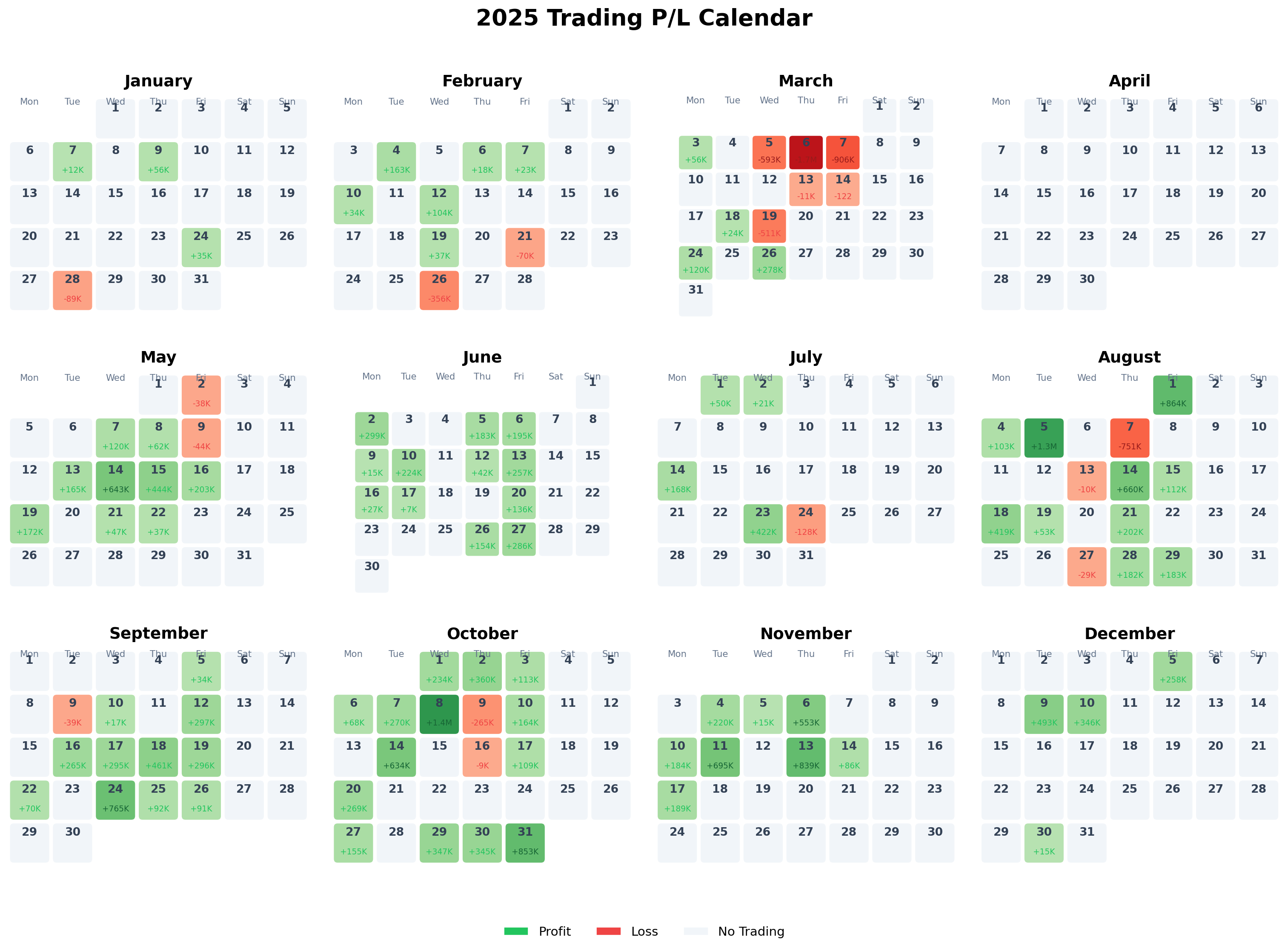
fig_2026 = create_calendar_heatmap(daily_pl, 2026)
plt.show()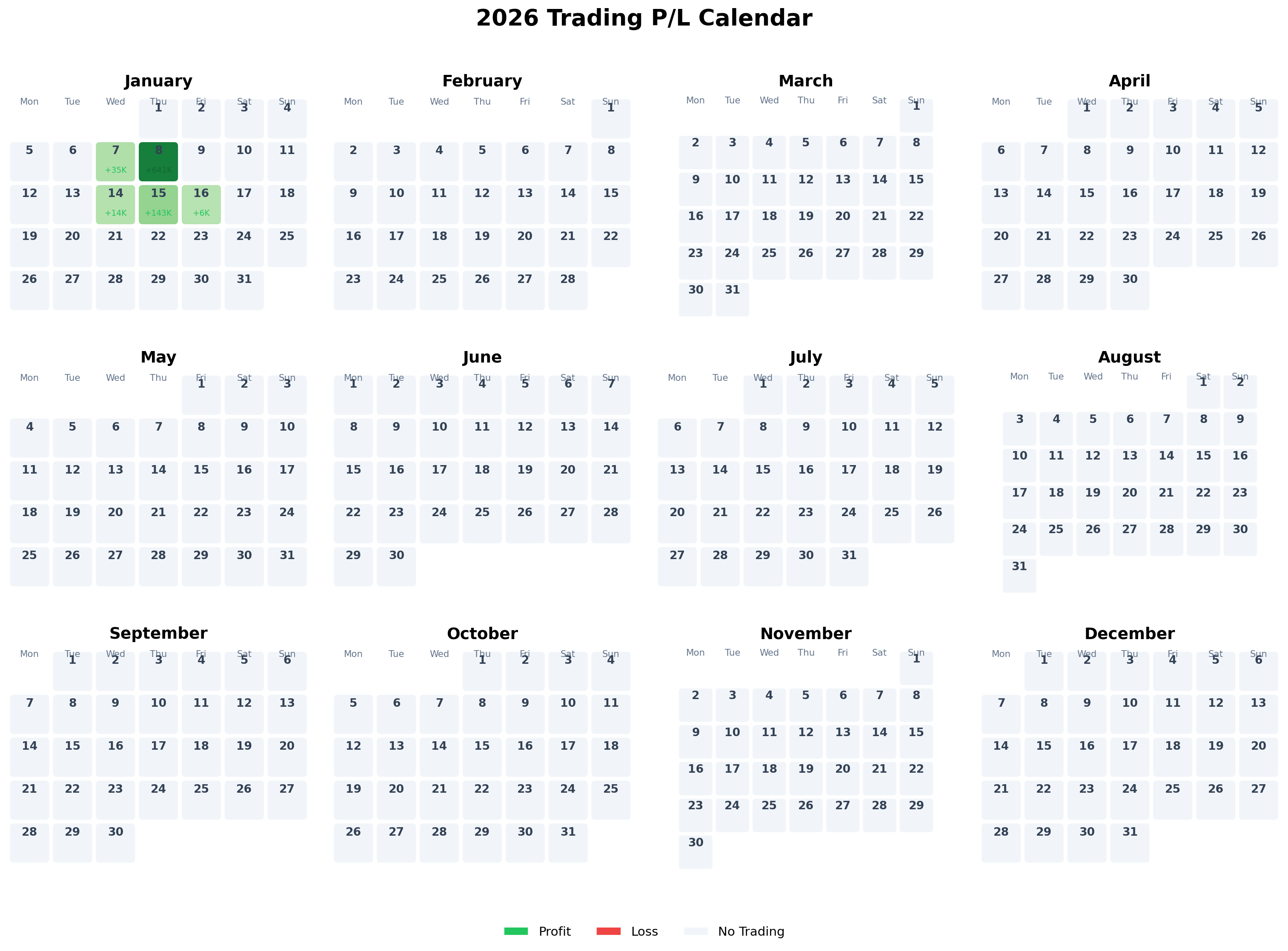
# Calculate monthly statistics for 2025
df_2025 = daily_pl[daily_pl['date'].dt.year == 2025].copy()
df_2025['month'] = df_2025['date'].dt.month

monthly_stats = df_2025.groupby('month').agg({
    'profit_jpy': ['sum', 'count', 'mean', lambda x: (x > 0).sum()]
}).reset_index()
monthly_stats.columns = ['Month', 'Total P/L', 'Trading Days', 'Avg P/L', 'Profitable Days']
monthly_stats['Month'] = monthly_stats['Month'].apply(lambda x: calendar.month_name[x])
monthly_stats['Win Rate'] = (monthly_stats['Profitable Days'] / monthly_stats['Trading Days'] * 100).round(1)

# Format numbers
monthly_stats['Total P/L'] = monthly_stats['Total P/L'].apply(lambda x: f'¥{x:,.0f}')
monthly_stats['Avg P/L'] = monthly_stats['Avg P/L'].apply(lambda x: f'¥{x:,.0f}')
monthly_stats['Win Rate'] = monthly_stats['Win Rate'].apply(lambda x: f'{x}%')

monthly_stats| Month | Total P/L | Trading Days | Avg P/L | Profitable Days | Win Rate | |
|---|---|---|---|---|---|---|
| 0 | January | ¥14,432 | 4 | ¥3,608 | 3 | 75.0% |
| 1 | February | ¥-46,363 | 8 | ¥-5,795 | 6 | 75.0% |
| 2 | March | ¥-3,282,961 | 10 | ¥-328,296 | 4 | 40.0% |
| 3 | May | ¥1,811,121 | 11 | ¥164,647 | 9 | 81.8% |
| 4 | June | ¥1,823,545 | 12 | ¥151,962 | 12 | 100.0% |
| 5 | July | ¥533,590 | 5 | ¥106,718 | 4 | 80.0% |
| 6 | August | ¥3,253,378 | 13 | ¥250,260 | 10 | 76.9% |
| 7 | September | ¥2,643,828 | 12 | ¥220,319 | 11 | 91.7% |
| 8 | October | ¥5,055,854 | 16 | ¥315,991 | 14 | 87.5% |
| 9 | November | ¥2,780,676 | 8 | ¥347,584 | 8 | 100.0% |
| 10 | December | ¥1,112,490 | 4 | ¥278,122 | 4 | 100.0% |
# Calculate key metrics
total_2025 = daily_pl[daily_pl['date'].dt.year == 2025]['profit_jpy'].sum()
best_day = daily_pl.loc[daily_pl['profit_jpy'].idxmax()]
worst_day = daily_pl.loc[daily_pl['profit_jpy'].idxmin()]
avg_profit = daily_pl[daily_pl['profit_jpy'] > 0]['profit_jpy'].mean()
avg_loss = daily_pl[daily_pl['profit_jpy'] < 0]['profit_jpy'].mean()

print(f"=== 2025 Trading Summary ===")
print(f"Total P/L: ¥{total_2025:,.0f}")
print(f"Best Day: {best_day['date'].strftime('%Y-%m-%d')} (¥{best_day['profit_jpy']:+,.0f})")
print(f"Worst Day: {worst_day['date'].strftime('%Y-%m-%d')} (¥{worst_day['profit_jpy']:+,.0f})")
print(f"Average Profit (winning days): ¥{avg_profit:,.0f}")
print(f"Average Loss (losing days): ¥{avg_loss:,.0f}")
=== 2025 Trading Summary ===
Total P/L: ¥15,699,590
Best Day: 2024-01-05 (¥+2,087,731)
Worst Day: 2024-08-07 (¥-3,478,929)
Average Profit (winning days): ¥301,577
Average Loss (losing days): ¥-373,637Traditional Calendar Layout: Familiar format makes it easy to navigate and understand temporal patterns.
Color Intensity: Gradient intensity reflects the magnitude of profit/loss, allowing quick identification of best and worst days.
Compact Labels: Using K (thousands) and M (millions) notation keeps cells readable.
Monthly Grid: 3x4 layout shows the entire year at once for pattern recognition.
Light Theme: Clean, professional appearance suitable for sharing and printing.
This post is part of the MakeoverMonday weekly data visualization project.