---
title: "TidyTuesday: Trading P/L Calendar Heatmap"
description: "A traditional calendar visualization showing daily realized profit/loss from stock trading using ggplot2"
date: "2026-01-21"
x-posted: true
author: "chokotto"
categories: ["TidyTuesday", "Data Viz", "R", "Finance", "Trading"]
image: "thumbnail.svg"
engine: knitr
freeze: false
execute:
warning: false
message: false
code-fold: true
code-tools: true
code-summary: "Show code"
twitter-card:
card-type: summary_large_image
image: "thumbnail.png"
title: "TidyTuesday: Trading P/L Calendar"
description: "Daily profit/loss calendar heatmap with ggplot2"
---
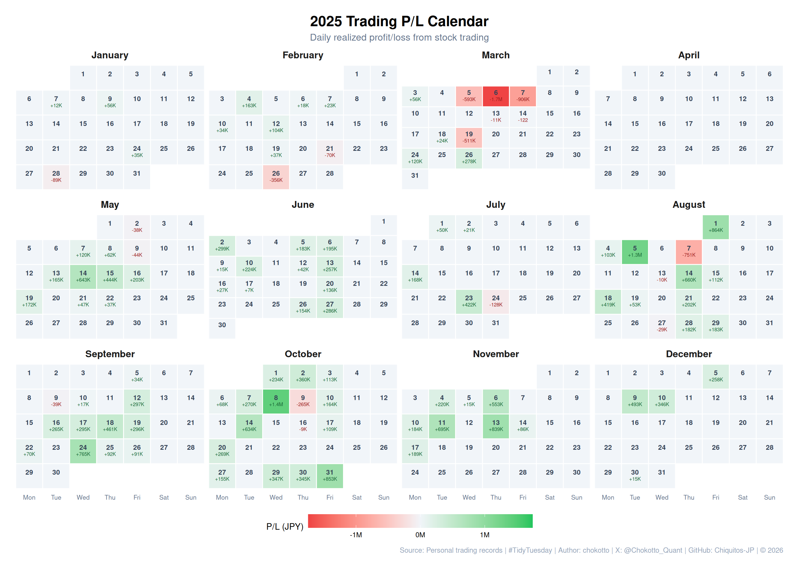
## Overview
This week's TidyTuesday visualizes my personal stock trading realized profit/loss in a traditional calendar format.
Using ggplot2's `geom_tile()`, each day displays: - **Date number** - **Profit/Loss amount** (in JPY) - **Color coding**: Green for profit, Red for loss, Gray for no trading
This visualization makes it easy to identify profitable and losing days across the year.
## Dataset
**Source**: Personal trading records from Rakuten Securities (JP/US) and SBI Securities (US)
```{r}
#| label: load-packages
#| message: false
#| warning: false
# Increase R stack size to prevent overflow with large plots
options(expressions = 50000)

library(tidyverse)
library(scales)
library(arrow)

# Load TidyTuesday helpers
# Project root is 5 levels up from this qmd file
project_root <- normalizePath(file.path(getwd(), "../../../../.."))
helpers_path <- file.path(project_root, "config", "R", "tidytuesday_helpers.R")
if (file.exists(helpers_path)) {
  source(helpers_path, local = FALSE)
} else {
  message("Helpers not found at: ", helpers_path)
}
```
```{r}
#| label: load-data
#| message: false
# Load aggregated daily P/L data (pre-processed)
daily_pl_path <- file.path(getwd(), "data", "daily_pl.parquet")
daily_pl <- read_parquet(daily_pl_path) %>%
  mutate(date = as.Date(date))

cat("Trading days:", nrow(daily_pl), "\n")
cat("Date range:", as.character(min(daily_pl$date)), "to", as.character(max(daily_pl$date)), "\n")
cat("Profitable days:", sum(daily_pl$profit_jpy > 0), "\n")
cat("Losing days:", sum(daily_pl$profit_jpy < 0), "\n")
daily_pl %>% head()
```
## Calendar Visualization Function
```{r}
#| label: calendar-function
create_calendar_heatmap <- function(data, year, title_suffix = "") {
  # Filter for specified year
  year_data <- data %>%
    filter(year(date) == year) %>%
    mutate(
      month = month(date),
      day = day(date),
      wday = wday(date, week_start = 1),  # Monday = 1
      week_of_month = ceiling((day + wday(floor_date(date, "month"), week_start = 1) - 1) / 7)
    )

  # Create full calendar grid
  all_dates <- tibble(
    date = seq(ymd(paste0(year, "-01-01")), ymd(paste0(year, "-12-31")), by = "day")
  ) %>%
    mutate(
      month = month(date),
      day = day(date),
      wday = wday(date, week_start = 1),
      week_of_month = ceiling((day + wday(floor_date(date, "month"), week_start = 1) - 1) / 7),
      month_name = factor(month.name[month], levels = month.name)
    )

  # Join with trading data
  calendar_data <- all_dates %>%
    left_join(year_data %>% select(date, profit_jpy, trades), by = "date") %>%
    mutate(
      status = case_when(
        is.na(profit_jpy) ~ "no_trade",
        profit_jpy > 0 ~ "profit",
        profit_jpy < 0 ~ "loss",
        TRUE ~ "no_trade"
      ),
      # Format label
      label = case_when(
        is.na(profit_jpy) ~ "",
        abs(profit_jpy) >= 1000000 ~ sprintf("%+.1fM", profit_jpy / 1000000),
        abs(profit_jpy) >= 1000 ~ sprintf("%+.0fK", profit_jpy / 1000),
        TRUE ~ sprintf("%+.0f", profit_jpy)
      )
    )

  # Weekday labels
  wday_labels <- c("Mon", "Tue", "Wed", "Thu", "Fri", "Sat", "Sun")

  # Create plot
  p <- ggplot(calendar_data, aes(x = wday, y = week_of_month)) +
    # Tiles
    geom_tile(
      aes(fill = profit_jpy),
      color = "white",
      linewidth = 0.5
    ) +
    # Day numbers
    geom_text(
      aes(label = day),
      vjust = -0.3,
      size = 3,
      fontface = "bold",
      color = "#334155"
    ) +
    # P/L labels
    geom_text(
      aes(
        label = label,
        color = status
      ),
      vjust = 1.2,
      size = 2.2,
      fontface = "plain"
    ) +
    # Color scales
    scale_fill_gradient2(
      low = "#ef4444",
      mid = "#f1f5f9",
      high = "#22c55e",
      midpoint = 0,
      na.value = "#f1f5f9",
      limits = c(-max(abs(calendar_data$profit_jpy), na.rm = TRUE),
                  max(abs(calendar_data$profit_jpy), na.rm = TRUE)),
      labels = label_number(scale = 1e-6, suffix = "M"),
      name = "P/L (JPY)"
    ) +
    scale_color_manual(
      values = c("profit" = "#166534", "loss" = "#991b1b", "no_trade" = "#94a3b8"),
      guide = "none"
    ) +
    scale_x_continuous(
      breaks = 1:7,
      labels = wday_labels,
      expand = c(0, 0)
    ) +
    scale_y_reverse(
      expand = c(0.02, 0)
    ) +
    # Facet by month
    facet_wrap(~ month_name, ncol = 4, scales = "free_y") +
    # Labels
    labs(
      title = paste0(year, " Trading P/L Calendar", title_suffix),
      subtitle = "Daily realized profit/loss from stock trading",
      caption = tt_caption(source = "Personal trading records"),
      x = NULL,
      y = NULL
    ) +
    # Theme
    theme_minimal(base_size = 11) +
    theme(
      plot.title = element_text(face = "bold", size = 18, hjust = 0.5),
      plot.subtitle = element_text(color = "#64748b", size = 12, hjust = 0.5),
      plot.caption = element_text(color = "#94a3b8", size = 9),
      strip.text = element_text(face = "bold", size = 12),
      panel.grid = element_blank(),
      axis.text.y = element_blank(),
      axis.text.x = element_text(size = 8, color = "#64748b"),
      legend.position = "bottom",
      legend.key.width = unit(2, "cm"),
      plot.margin = margin(20, 20, 20, 20)
    )

  return(p)
}
```
## 2025 Calendar
```{r}
#| label: calendar-2025
#| fig-width: 14
#| fig-height: 10
p_2025 <- create_calendar_heatmap(daily_pl, 2025)
p_2025
```
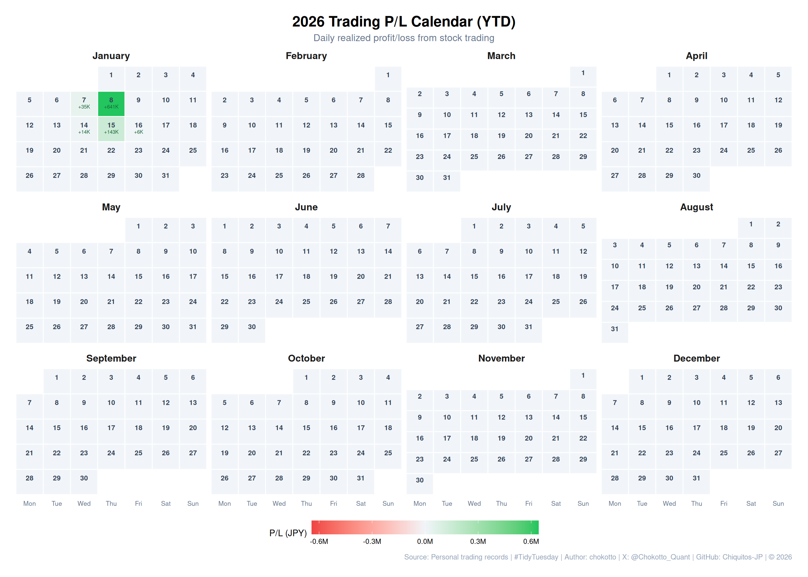
## 2026 Calendar (Year to Date)
```{r}
#| label: calendar-2026
#| fig-width: 14
#| fig-height: 10
p_2026 <- create_calendar_heatmap(daily_pl, 2026, " (YTD)")
p_2026
```
## Monthly Summary Statistics
```{r}
#| label: monthly-summary
# Calculate monthly statistics for 2025
monthly_stats <- daily_pl %>%
  filter(year(date) == 2025) %>%
  mutate(month = month(date, label = TRUE, abbr = FALSE)) %>%
  group_by(month) %>%
  summarise(
    `Total P/L` = sum(profit_jpy),
    `Trading Days` = n(),
    `Avg P/L` = mean(profit_jpy),
    `Profitable Days` = sum(profit_jpy > 0),
    `Win Rate` = mean(profit_jpy > 0) * 100
  ) %>%
  mutate(
    `Total P/L` = scales::number(`Total P/L`, prefix = "¥", big.mark = ","),
    `Avg P/L` = scales::number(`Avg P/L`, prefix = "¥", big.mark = ","),
    `Win Rate` = paste0(round(`Win Rate`, 1), "%")
  )

monthly_stats %>%
  knitr::kable()
```
## Key Insights
```{r}
#| label: insights
# Calculate key metrics
total_2025 <- daily_pl %>%
  filter(year(date) == 2025) %>%
  summarise(total = sum(profit_jpy)) %>%
  pull(total)

best_day <- daily_pl %>%
  filter(profit_jpy == max(profit_jpy))

worst_day <- daily_pl %>%
  filter(profit_jpy == min(profit_jpy))

avg_profit <- daily_pl %>%
  filter(profit_jpy > 0) %>%
  summarise(avg = mean(profit_jpy)) %>%
  pull(avg)

avg_loss <- daily_pl %>%
  filter(profit_jpy < 0) %>%
  summarise(avg = mean(profit_jpy)) %>%
  pull(avg)

cat("=== 2025 Trading Summary ===\n")
cat("Total P/L:", scales::number(total_2025, prefix = "¥", big.mark = ","), "\n")
cat("Best Day:", as.character(best_day$date), "(", scales::number(best_day$profit_jpy, prefix = "¥", big.mark = ","), ")\n")
cat("Worst Day:", as.character(worst_day$date), "(", scales::number(worst_day$profit_jpy, prefix = "¥", big.mark = ","), ")\n")
cat("Average Profit (winning days):", scales::number(avg_profit, prefix = "¥", big.mark = ","), "\n")
cat("Average Loss (losing days):", scales::number(avg_loss, prefix = "¥", big.mark = ","), "\n")
```
## Design Approach
1. **ggplot2 + geom_tile()**: Creates a clean grid-based calendar layout with proper spacing.
2. **Diverging Color Scale**: `scale_fill_gradient2()` centers at zero, making profits (green) and losses (red) immediately distinguishable.
3. **Faceted Layout**: `facet_wrap()` with 4 columns displays all 12 months in a compact 3x4 grid.
4. **Dual Text Labels**: Day numbers at top, P/L values below, with conditional coloring for readability.
5. **Clean Theme**: Minimal gridlines and muted colors keep focus on the data.
------------------------------------------------------------------------
*This post is part of the [TidyTuesday](https://github.com/rfordatascience/tidytuesday) weekly data visualization project.*
:::: {.callout-caution collapse="false" appearance="minimal" icon="false"}
## Disclaimer
::: {style="font-size: 0.85em; color: #64748b; line-height: 1.6;"}
This analysis is for educational and practice purposes only.
The profit/loss figures shown are from personal trading records and should not be considered as investment advice or performance guarantees.
:::
::::