---
title: "TidyTuesday: Risk Exposure Analysis"
description: "Visualizing the relationship between Cash Reserve (PAT Balance) and Margin Exposure over time using ggplot2"
date: "2026-01-28"
x-posted: true
author: "chokotto"
categories: ["TidyTuesday", "Data Viz", "R", "Finance", "Trading", "Risk"]
image: "thumbnail.svg"
engine: knitr
freeze: false
execute:
warning: false
message: false
code-fold: true
code-tools: true
code-summary: "Show code"
twitter-card:
card-type: summary_large_image
image: "thumbnail.png"
title: "TidyTuesday: Risk Exposure Analysis"
description: "Cash Reserve vs Margin Exposure time series with ggplot2"
---
## Overview
This week's TidyTuesday visualizes the relationship between **Cash Reserve** (cumulative post-tax profit) and **Margin Exposure** (open margin positions) from my personal trading accounts.
Key metrics:
- **PAT Balance**: Cumulative Profit After Tax - represents available cash reserve
- **Exposure**: Total margin position value (JPY equivalent)
- **Exposure Ratio**: Exposure / \|PAT Balance\| - measures leverage relative to cash reserve
## Dataset
**Source**: Personal trading records from Rakuten Securities (JP/US) and SBI Securities (US)
```{r}
#| label: load-packages
#| message: false
#| warning: false
library(tidyverse)
library(scales)
library(arrow)
library(patchwork)

# Load TidyTuesday helpers
project_root <- normalizePath(file.path(getwd(), "../../../../.."))
helpers_path <- file.path(project_root, "config", "R", "tidytuesday_helpers.R")
if (file.exists(helpers_path)) {
  source(helpers_path, local = FALSE)
} else {
  message("Helpers not found at: ", helpers_path)
}
```
```{r}
#| label: load-data
#| message: false
# Load monthly balance data (pre-processed)
data_path <- file.path(getwd(), "data", "monthly_balance.parquet")

if (file.exists(data_path)) {
  monthly_balance <- read_parquet(data_path) %>%
    mutate(
      date = as.Date(date),
      year_month = format(date, "%Y-%m")
    )
  cat("Loaded", nrow(monthly_balance), "monthly balance records\n")
} else {
  stop("Data not found at: ", data_path)
}
# Calculate totals
total_by_month <- monthly_balance %>%
  group_by(year_month, date) %>%
  summarise(
    pat_balance = sum(pat_balance, na.rm = TRUE),
    exposure = sum(exposure, na.rm = TRUE),
    .groups = "drop"
  ) %>%
  mutate(
    broker = "Total",
    exposure_ratio = if_else(
      pat_balance != 0,
      exposure / abs(pat_balance) * 100,
      NA_real_
    )
  )

# Add ratio to monthly_balance
monthly_balance <- monthly_balance %>%
  mutate(
    exposure_ratio = if_else(
      pat_balance != 0,
      exposure / abs(pat_balance) * 100,
      NA_real_
    )
  )

# Combine
all_data <- bind_rows(monthly_balance, total_by_month)

cat("Date range:", min(all_data$year_month), "to", max(all_data$year_month), "\n")
cat("Brokers:", paste(unique(all_data$broker), collapse = ", "), "\n")
```
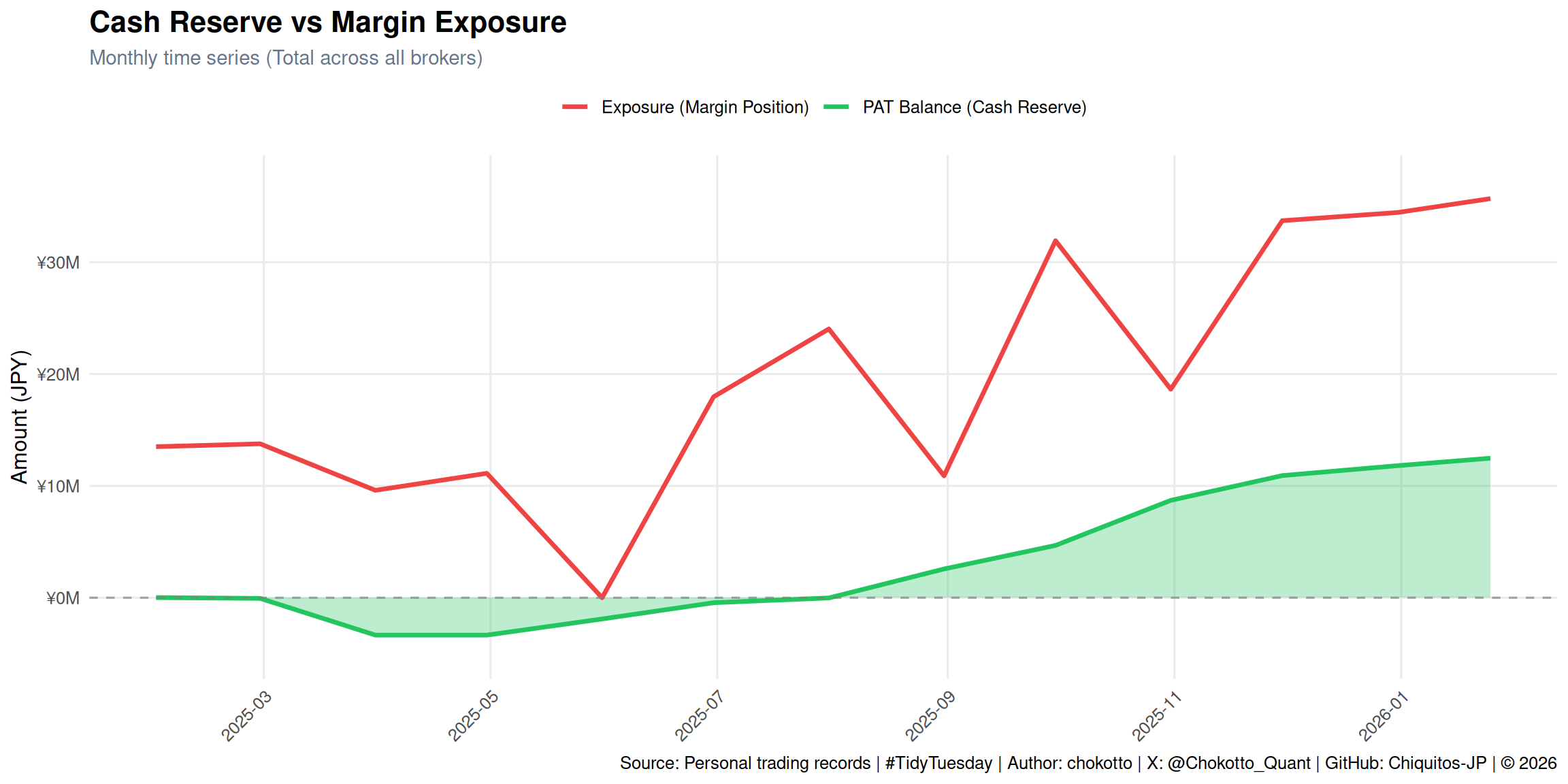
## Chart 1: PAT Balance & Exposure Time Series
```{r}
#| label: chart-1-amounts
#| fig-width: 12
#| fig-height: 6
# Prepare data for dual-axis simulation
total_data <- all_data %>%
  filter(broker == "Total") %>%
  select(date, pat_balance, exposure) %>%
  pivot_longer(
    cols = c(pat_balance, exposure),
    names_to = "metric",
    values_to = "value"
  ) %>%
  mutate(
    metric = case_when(
      metric == "pat_balance" ~ "PAT Balance (Cash Reserve)",
      metric == "exposure" ~ "Exposure (Margin Position)"
    )
  )

p1 <- ggplot(total_data, aes(x = date, y = value, color = metric, fill = metric)) +
  geom_area(
    data = filter(total_data, metric == "PAT Balance (Cash Reserve)"),
    alpha = 0.3,
    show.legend = FALSE
  ) +
  geom_line(linewidth = 1.2) +
  geom_hline(yintercept = 0, linetype = "dashed", color = "gray50", alpha = 0.7) +
  scale_y_continuous(
    labels = label_number(scale = 1e-6, suffix = "M", prefix = "¥"),
    expand = expansion(mult = c(0.1, 0.1))
  ) +
  scale_x_date(
    date_breaks = "2 months",
    date_labels = "%Y-%m"
  ) +
  scale_color_manual(
    values = c("PAT Balance (Cash Reserve)" = "#22c55e", "Exposure (Margin Position)" = "#ef4444"),
    name = NULL
  ) +
  scale_fill_manual(
    values = c("PAT Balance (Cash Reserve)" = "#22c55e", "Exposure (Margin Position)" = "#ef4444")
  ) +
  labs(
    title = "Cash Reserve vs Margin Exposure",
    subtitle = "Monthly time series (Total across all brokers)",
    x = NULL,
    y = "Amount (JPY)",
    caption = tt_caption(source = "Personal trading records")
  ) +
  theme_minimal(base_size = 12) +
  theme(
    plot.title = element_text(face = "bold", size = 16),
    plot.subtitle = element_text(color = "#64748b", size = 11),
    legend.position = "top",
    legend.justification = "center",
    axis.text.x = element_text(angle = 45, hjust = 1),
    panel.grid.minor = element_blank()
  )

p1
```
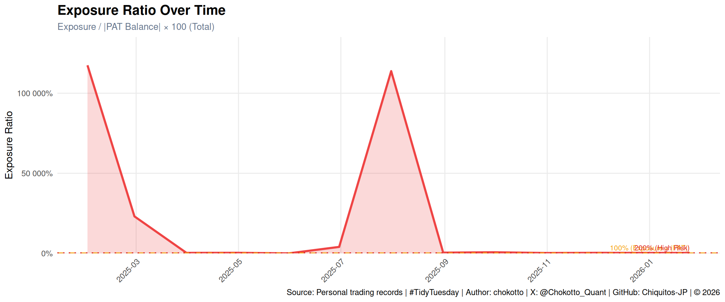
## Chart 2: Exposure Ratio Time Series
```{r}
#| label: chart-2-ratio
#| fig-width: 12
#| fig-height: 5
ratio_data <- all_data %>%
  filter(broker == "Total", !is.na(exposure_ratio))

p2 <- ggplot(ratio_data, aes(x = date, y = exposure_ratio)) +
  geom_area(fill = "#ef4444", alpha = 0.2) +
  geom_line(color = "#ef4444", linewidth = 1.2) +
  geom_hline(
    yintercept = 100,
    linetype = "dashed",
    color = "#f59e0b",
    linewidth = 0.8
  ) +
  geom_hline(
    yintercept = 200,
    linetype = "dotted",
    color = "#dc2626",
    linewidth = 0.8
  ) +
  annotate(
    "text",
    x = max(ratio_data$date),
    y = 105,
    label = "100% (Exposure = |PAT|)",
    hjust = 1,
    vjust = -0.5,
    color = "#f59e0b",
    size = 3
  ) +
  annotate(
    "text",
    x = max(ratio_data$date),
    y = 205,
    label = "200% (High Risk)",
    hjust = 1,
    vjust = -0.5,
    color = "#dc2626",
    size = 3
  ) +
  scale_y_continuous(
    labels = label_percent(scale = 1),
    expand = expansion(mult = c(0, 0.15))
  ) +
  scale_x_date(
    date_breaks = "2 months",
    date_labels = "%Y-%m"
  ) +
  labs(
    title = "Exposure Ratio Over Time",
    subtitle = "Exposure / |PAT Balance| × 100 (Total)",
    x = NULL,
    y = "Exposure Ratio",
    caption = tt_caption(source = "Personal trading records")
  ) +
  theme_minimal(base_size = 12) +
  theme(
    plot.title = element_text(face = "bold", size = 16),
    plot.subtitle = element_text(color = "#64748b", size = 11),
    axis.text.x = element_text(angle = 45, hjust = 1),
    panel.grid.minor = element_blank()
  )

p2
```
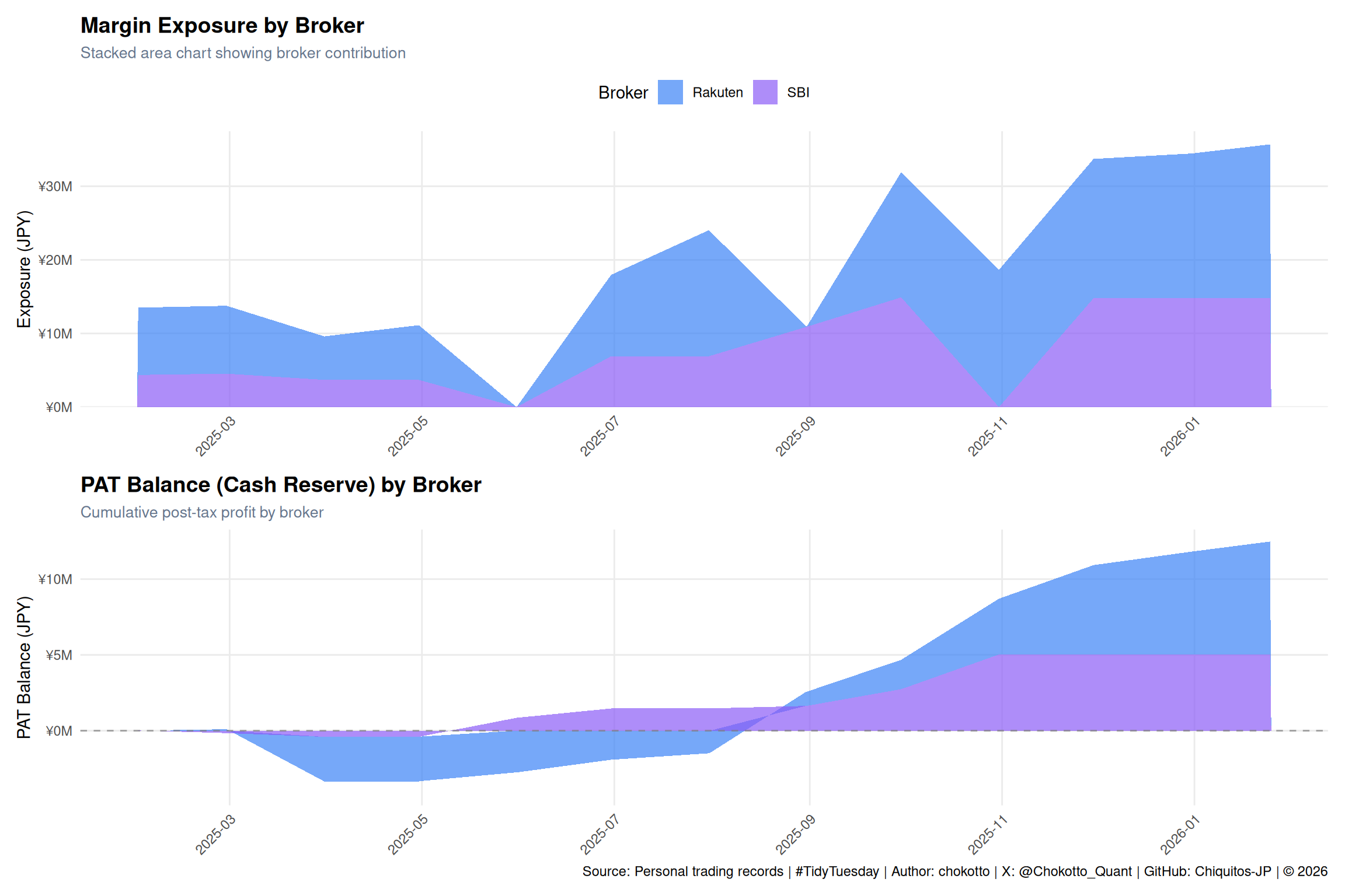
## Chart 3: Broker Breakdown
```{r}
#| label: chart-3-broker
#| fig-width: 12
#| fig-height: 8
broker_data <- all_data %>%
  filter(broker != "Total")

broker_colors <- c("Rakuten" = "#3b82f6", "SBI" = "#8b5cf6")

# Exposure by broker
p3a <- ggplot(broker_data, aes(x = date, y = exposure, fill = broker)) +
  geom_area(alpha = 0.7, position = "stack") +
  scale_y_continuous(
    labels = label_number(scale = 1e-6, suffix = "M", prefix = "¥"),
    expand = expansion(mult = c(0, 0.05))
  ) +
  scale_x_date(
    date_breaks = "2 months",
    date_labels = "%Y-%m"
  ) +
  scale_fill_manual(values = broker_colors, name = "Broker") +
  labs(
    title = "Margin Exposure by Broker",
    subtitle = "Stacked area chart showing broker contribution",
    x = NULL,
    y = "Exposure (JPY)"
  ) +
  theme_minimal(base_size = 11) +
  theme(
    plot.title = element_text(face = "bold", size = 14),
    plot.subtitle = element_text(color = "#64748b", size = 10),
    legend.position = "top",
    axis.text.x = element_text(angle = 45, hjust = 1),
    panel.grid.minor = element_blank()
  )

# PAT Balance by broker
p3b <- ggplot(broker_data, aes(x = date, y = pat_balance, fill = broker)) +
  geom_area(alpha = 0.7, position = "stack") +
  geom_hline(yintercept = 0, linetype = "dashed", color = "gray50", alpha = 0.7) +
  scale_y_continuous(
    labels = label_number(scale = 1e-6, suffix = "M", prefix = "¥"),
    expand = expansion(mult = c(0.1, 0.05))
  ) +
  scale_x_date(
    date_breaks = "2 months",
    date_labels = "%Y-%m"
  ) +
  scale_fill_manual(values = broker_colors, name = "Broker") +
  labs(
    title = "PAT Balance (Cash Reserve) by Broker",
    subtitle = "Cumulative post-tax profit by broker",
    x = NULL,
    y = "PAT Balance (JPY)",
    caption = tt_caption(source = "Personal trading records")
  ) +
  theme_minimal(base_size = 11) +
  theme(
    plot.title = element_text(face = "bold", size = 14),
    plot.subtitle = element_text(color = "#64748b", size = 10),
    legend.position = "top",
    axis.text.x = element_text(angle = 45, hjust = 1),
    panel.grid.minor = element_blank()
  )

# Combine with patchwork
p3a / p3b + plot_layout(guides = "collect") & theme(legend.position = "top")
```
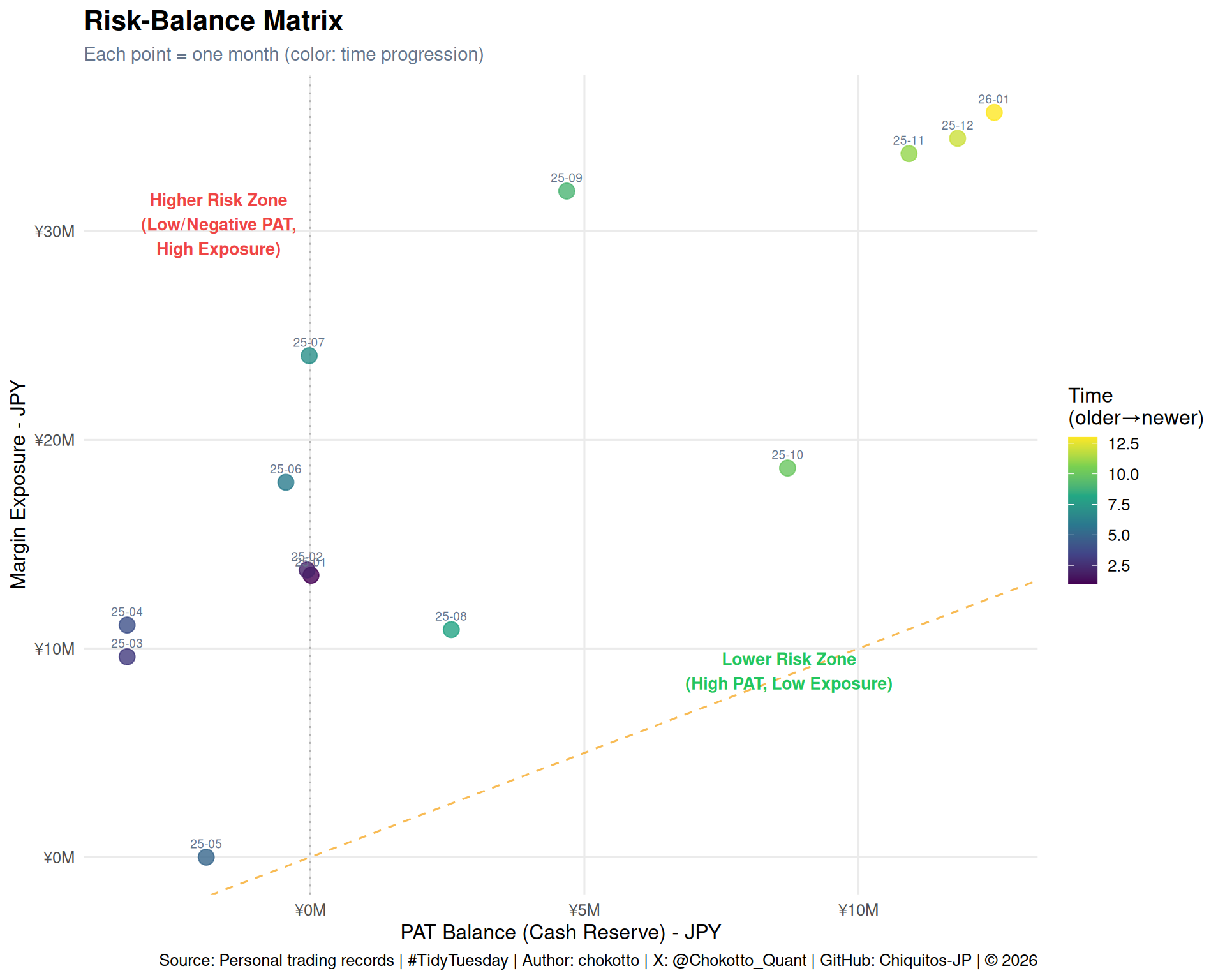
## Chart 4: Risk-Balance Matrix
```{r}
#| label: chart-4-scatter
#| fig-width: 10
#| fig-height: 8
scatter_data <- all_data %>%
  filter(broker == "Total") %>%
  mutate(
    time_index = row_number(),
    label = substr(year_month, 3, 7)  # YY-MM format
  )

# Calculate max for diagonal line
max_val <- max(c(max(scatter_data$exposure), max(abs(scatter_data$pat_balance))))
min_val <- min(c(min(scatter_data$pat_balance), 0))

p4 <- ggplot(scatter_data, aes(x = pat_balance, y = exposure)) +
  # Diagonal reference line (100%)
  geom_abline(
    slope = 1,
    intercept = 0,
    linetype = "dashed",
    color = "#f59e0b",
    alpha = 0.7
  ) +
  # Zero PAT line
  geom_vline(xintercept = 0, linetype = "dotted", color = "gray50", alpha = 0.5) +
  # Points with color gradient
  geom_point(
    aes(color = time_index),
    size = 4,
    alpha = 0.8
  ) +
  # Labels
  geom_text(
    aes(label = label),
    vjust = -1,
    size = 2.5,
    color = "#64748b"
  ) +
  # Color scale
  scale_color_viridis_c(
    name = "Time\n(older→newer)",
    option = "viridis"
  ) +
  scale_x_continuous(
    labels = label_number(scale = 1e-6, suffix = "M", prefix = "¥")
  ) +
  scale_y_continuous(
    labels = label_number(scale = 1e-6, suffix = "M", prefix = "¥")
  ) +
  # Annotations for risk zones
  annotate(
    "text",
    x = max(scatter_data$pat_balance) * 0.7,
    y = max(scatter_data$exposure) * 0.25,
    label = "Lower Risk Zone\n(High PAT, Low Exposure)",
    color = "#22c55e",
    size = 3.5,
    fontface = "bold"
  ) +
  annotate(
    "text",
    x = ifelse(min(scatter_data$pat_balance) < 0, min(scatter_data$pat_balance) * 0.5, max(scatter_data$pat_balance) * 0.2),
    y = max(scatter_data$exposure) * 0.85,
    label = "Higher Risk Zone\n(Low/Negative PAT,\nHigh Exposure)",
    color = "#ef4444",
    size = 3.5,
    fontface = "bold"
  ) +
  labs(
    title = "Risk-Balance Matrix",
    subtitle = "Each point = one month (color: time progression)",
    x = "PAT Balance (Cash Reserve) - JPY",
    y = "Margin Exposure - JPY",
    caption = tt_caption(source = "Personal trading records")
  ) +
  theme_minimal(base_size = 12) +
  theme(
    plot.title = element_text(face = "bold", size = 16),
    plot.subtitle = element_text(color = "#64748b", size = 11),
    legend.position = "right",
    panel.grid.minor = element_blank()
  )

p4
```
## Summary Statistics
```{r}
#| label: summary-stats
total_summary <- all_data %>%
  filter(broker == "Total")

cat("=== Risk Exposure Summary ===\n\n")
cat("Analysis Period:", min(total_summary$year_month), "to", max(total_summary$year_month), "\n")
cat("Total Months:", nrow(total_summary), "\n\n")
cat("PAT Balance (Cash Reserve):\n")
cat(" Current:", scales::number(tail(total_summary$pat_balance, 1), prefix = "¥", big.mark = ","), "\n")
cat(" Maximum:", scales::number(max(total_summary$pat_balance), prefix = "¥", big.mark = ","), "\n")
cat(" Minimum:", scales::number(min(total_summary$pat_balance), prefix = "¥", big.mark = ","), "\n\n")
cat("Exposure (Margin Position):\n")
cat(" Current:", scales::number(tail(total_summary$exposure, 1), prefix = "¥", big.mark = ","), "\n")
cat(" Maximum:", scales::number(max(total_summary$exposure), prefix = "¥", big.mark = ","), "\n")
cat(" Minimum:", scales::number(min(total_summary$exposure), prefix = "¥", big.mark = ","), "\n\n")
valid_ratios <- total_summary$exposure_ratio[!is.na(total_summary$exposure_ratio)]
if (length(valid_ratios) > 0) {
  cat("Exposure Ratio:\n")
  cat("  Current:", sprintf("%.1f%%", tail(valid_ratios, 1)), "\n")
  cat("  Maximum:", sprintf("%.1f%%", max(valid_ratios)), "\n")
  cat("  Average:", sprintf("%.1f%%", mean(valid_ratios)), "\n")
}
```
## Design Approach
1. **ggplot2 + scales**: Clean, publication-quality charts with proper number formatting for JPY.
2. **Viridis Color Scale**: Time progression in scatter plot uses colorblind-friendly Viridis palette.
3. **patchwork**: Combines multiple plots into cohesive layouts.
4. **Reference Lines**: 100% and 200% ratio lines provide quick risk assessment.
5. **Dual Perspectives**: Both absolute values and ratios shown for complete risk picture.
------------------------------------------------------------------------
*This post is part of the [TidyTuesday](https://github.com/rfordatascience/tidytuesday) weekly data visualization project.*
:::: {.callout-caution collapse="false" appearance="minimal" icon="false"}
## Disclaimer
::: {style="font-size: 0.85em; color: #64748b; line-height: 1.6;"}
This analysis is for educational and practice purposes only.
The figures shown are from personal trading records and should not be considered as investment advice.
Margin trading involves significant risk of loss.
:::
::::