Code
library(tidyverse)
library(arrow)
library(scales)
library(glue)This TidyTuesday project visualizes S&P 500 sector performance, comparing daily returns with year-to-date (YTD) performance for each sector ETF using R and ggplot2.
Key metrics:
library(tidyverse)
library(arrow)
library(scales)
library(glue)# Load pre-processed data (relative path from qmd file location)
data_file <- "data/sector_performance.parquet"
if (file.exists(data_file)) {
sector_data <- read_parquet(data_file)
cat("Data loaded successfully!\n")
cat(glue("Records: {nrow(sector_data)}\n"))
cat(glue("Data date: {unique(sector_data$data_date)}\n"))
} else {
stop("Data file not found. Run prepare_data.py first.")
}Data loaded successfully!
Records: 12Data date: 2026-04-17# Convert to long format for ggplot
sector_long <- sector_data |>
select(sector, daily_return, ytd_return, sort_order) |>
pivot_longer(
cols = c(daily_return, ytd_return),
names_to = "metric",
values_to = "value"
) |>
mutate(
metric = factor(
metric,
levels = c("daily_return", "ytd_return"),
labels = c("Daily", "Year-to-date")
),
sector = factor(sector, levels = sector_data$sector[order(sector_data$sort_order)])
)
# Get data date for title
data_date <- unique(sector_data$data_date)
data_date_formatted <- format(as.Date(data_date), "%m/%d/%Y")
# Preview data
glimpse(sector_long)Rows: 24
Columns: 4
$ sector <fct> Energy, Energy, Health Care, Health Care, Utilities, Utilit…
$ sort_order <int> 0, 0, 1, 1, 2, 2, 3, 3, 4, 4, 5, 5, 6, 6, 7, 7, 8, 8, 9, 9,…
$ metric <fct> Daily, Year-to-date, Daily, Year-to-date, Daily, Year-to-da…
$ value <dbl> -2.7571603, 21.3132212, 1.4937606, -3.9214749, -0.4099215, …# Define colors matching the reference
colors <- c("Daily" = "#1e5aa8", "Year-to-date" = "#d4a012")
# Create the grouped bar chart
p <- ggplot(sector_long, aes(x = sector, y = value, fill = metric)) +
geom_col(position = position_dodge(width = 0.7), width = 0.6) +
geom_hline(yintercept = 0, color = "black", linewidth = 0.5) +
geom_text(
aes(
label = sprintf("%.1f%%", value),
vjust = ifelse(value >= 0, -0.5, 1.5),
color = metric
),
position = position_dodge(width = 0.7),
size = 3,
show.legend = FALSE
) +
scale_fill_manual(values = colors) +
scale_color_manual(values = colors) +
scale_y_continuous(
labels = label_percent(scale = 1, accuracy = 1),
expand = expansion(mult = c(0.15, 0.15))
) +
labs(
title = glue("S&P 500 sector performance"),
subtitle = glue("Date: {data_date_formatted} | Year-to-date"),
x = NULL,
y = NULL,
fill = NULL
) +
theme_minimal(base_size = 12) +
theme(
plot.title = element_text(face = "bold", size = 16, hjust = 0),
plot.subtitle = element_text(size = 12, color = "gray40", hjust = 0),
axis.text.x = element_text(size = 10, angle = 0, hjust = 0.5),
axis.text.y = element_text(size = 10),
legend.position = "top",
legend.justification = "left",
panel.grid.major.x = element_blank(),
panel.grid.minor = element_blank(),
plot.margin = margin(20, 20, 20, 20)
)
print(p)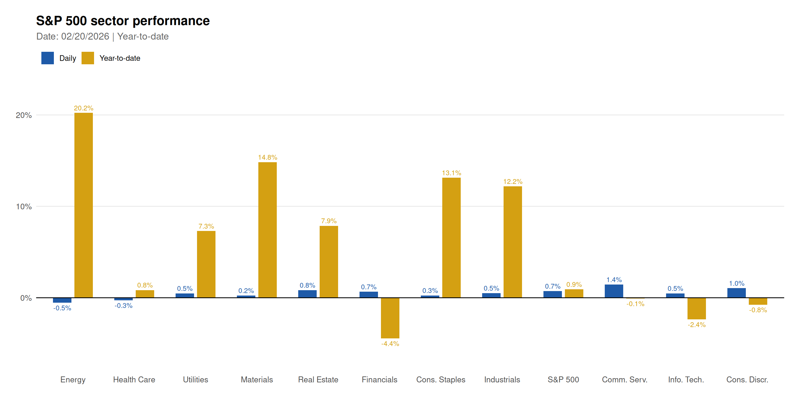
# Save for social media
ggsave(
  "chart-1.png",
  plot = p,
  width = 14,
  height = 7,
  dpi = 150,
  bg = "white"
)# Display formatted table
sector_data |>
select(Sector = sector,
`Daily Return` = daily_return,
`YTD Return` = ytd_return) |>
mutate(
`Daily Return` = sprintf("%+.2f%%", `Daily Return`),
`YTD Return` = sprintf("%+.2f%%", `YTD Return`)
) |>
knitr::kable(align = c("l", "r", "r"))| Sector | Daily Return | YTD Return |
|---|---|---|
| Energy | -2.76% | +21.31% |
| Health Care | +1.49% | -3.92% |
| Utilities | -0.41% | +7.65% |
| Materials | +0.25% | +12.99% |
| Real Estate | +1.53% | +10.89% |
| Financials | +0.77% | -4.06% |
| Cons. Staples | +1.26% | +6.74% |
| Industrials | +1.87% | +10.14% |
| S&P 500 | +1.21% | +4.23% |
| Comm. Serv. | +0.23% | +2.21% |
| Info. Tech. | +1.53% | +7.10% |
| Cons. Discr. | +2.36% | +1.94% |
# Create lollipop chart for YTD performance
ytd_data <- sector_data |>
  mutate(
    sector = factor(sector, levels = sector[order(ytd_return)]),
    color = ifelse(ytd_return >= 0, "#22c55e", "#ef4444")
  )

p_lollipop <- ggplot(ytd_data, aes(x = sector, y = ytd_return)) +
  geom_segment(
    aes(x = sector, xend = sector, y = 0, yend = ytd_return, color = color),
    linewidth = 1.5,
    show.legend = FALSE
  ) +
  geom_point(aes(color = color), size = 4, show.legend = FALSE) +
  geom_hline(yintercept = 0, color = "gray50", linewidth = 0.5) +
  geom_text(
    aes(label = sprintf("%+.1f%%", ytd_return)),
    hjust = ifelse(ytd_data$ytd_return >= 0, -0.3, 1.3),
    size = 3.5
  ) +
  scale_color_identity() +
  scale_y_continuous(
    labels = label_percent(scale = 1, accuracy = 1),
    expand = expansion(mult = c(0.1, 0.1))
  ) +
  coord_flip() +
  labs(
    title = "S&P 500 Sector YTD Performance",
    subtitle = glue("As of {data_date_formatted}"),
    x = NULL,
    y = "Year-to-Date Return (%)"
  ) +
  theme_minimal(base_size = 12) +
  theme(
    plot.title = element_text(face = "bold", size = 16),
    plot.subtitle = element_text(color = "gray40"),
    panel.grid.major.y = element_blank(),
    panel.grid.minor = element_blank()
  )

print(p_lollipop)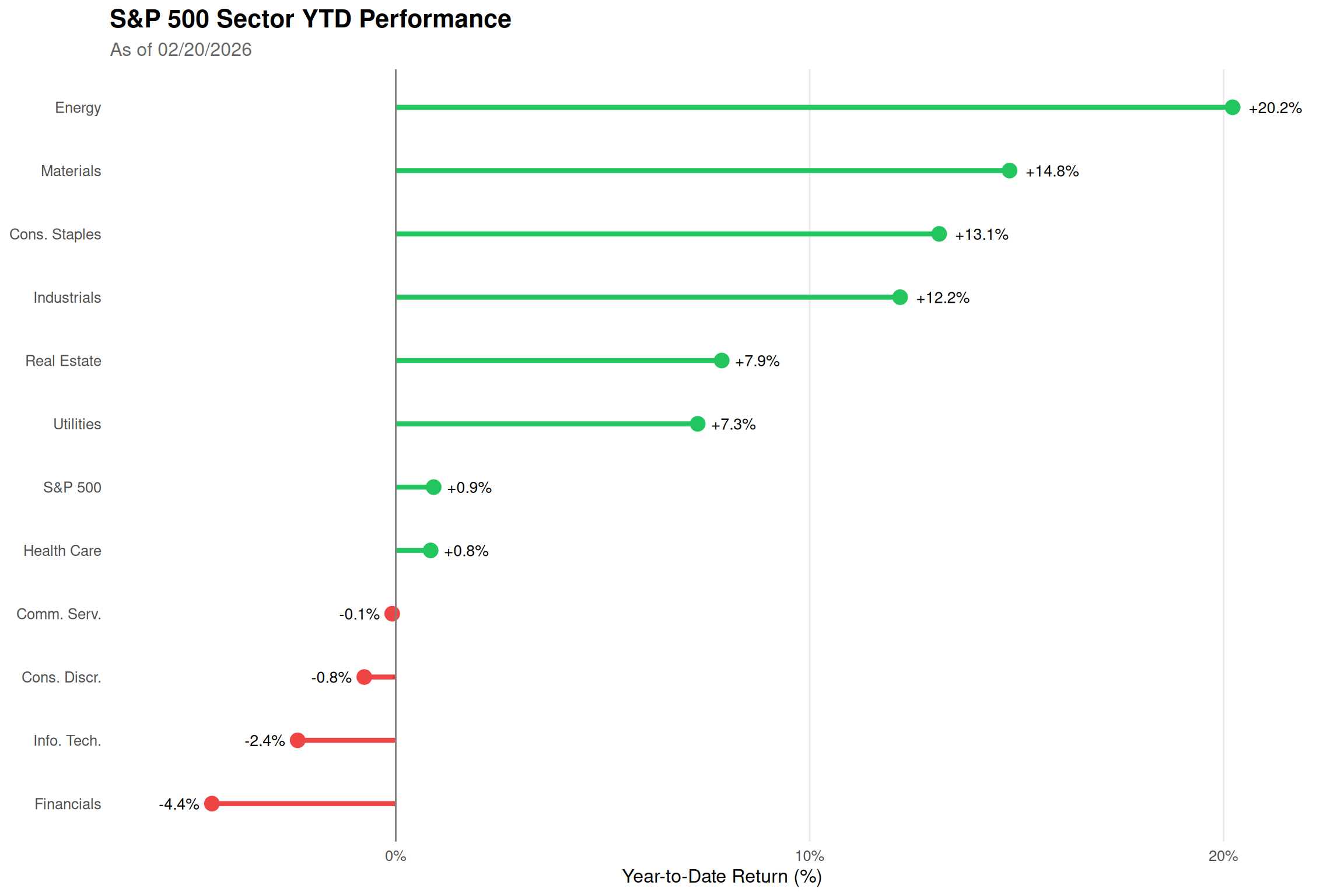
Sector Rotation: The chart reveals which sectors are leading market performance in the current year.
Daily vs YTD Divergence: Sectors with strong YTD but weak daily returns may be experiencing profit-taking.
Defensive vs Cyclical: Utilities and Consumer Staples are typically defensive, while Technology and Consumer Discretionary are more cyclical.
Benchmark Reference: S&P 500 (SPY) provides context for relative sector performance.
Grouped Bars: Side-by-side comparison makes it easy to compare daily vs YTD for each sector.
Color Scheme: Blue for daily (short-term), Gold for YTD (cumulative) - intuitive and consistent.
Data Labels: Percentage values shown above/below bars for quick reading.
Alternative View: Lollipop chart provides a different perspective focusing on YTD rankings.
Data source: Yahoo Finance. This post is part of the TidyTuesday weekly data visualization project.