Show code
library(tidyverse)
library(scales)
library(glue)
library(patchwork)This week’s TidyTuesday explores social media attention as a market signal by comparing Reddit discussion volume for two US stocks: SOFI (SoFi Technologies) and IONQ (IonQ Inc.). Using the same dataset as the companion MakeoverMonday post, we visualize comment counts from investment-focused subreddits using ggplot2.
library(tidyverse)
library(scales)
library(glue)
library(patchwork)data_dir <- file.path(getwd(), "data")
daily <- read_csv(file.path(data_dir, "reddit_daily_counts.csv"),
show_col_types = FALSE) |>
mutate(date = as.Date(date))
posts <- read_csv(file.path(data_dir, "reddit_posts.csv"),
show_col_types = FALSE) |>
mutate(date = as.Date(date))
by_sub <- read_csv(file.path(data_dir, "reddit_by_subreddit.csv"),
show_col_types = FALSE)
# 投資関連サブレディットのみフィルタ
invest_subs <- c(
"wallstreetbets", "stocks", "investing", "StockMarket", "options",
"SOFIstock", "sofi", "IonQ", "Superstonk", "Pennystock",
"premarketStockTraders", "TeamRKT", "Webull"
)
posts_f <- posts |> filter(subreddit %in% invest_subs)
daily_f <- posts_f |>
group_by(date, symbol) |>
summarise(
post_count = n(),
total_comments = sum(num_comments, na.rm = TRUE),
total_score = sum(score, na.rm = TRUE),
.groups = "drop"
) |>
arrange(date, symbol)
cat(glue("Investment subs: {nrow(posts_f)} posts | ",
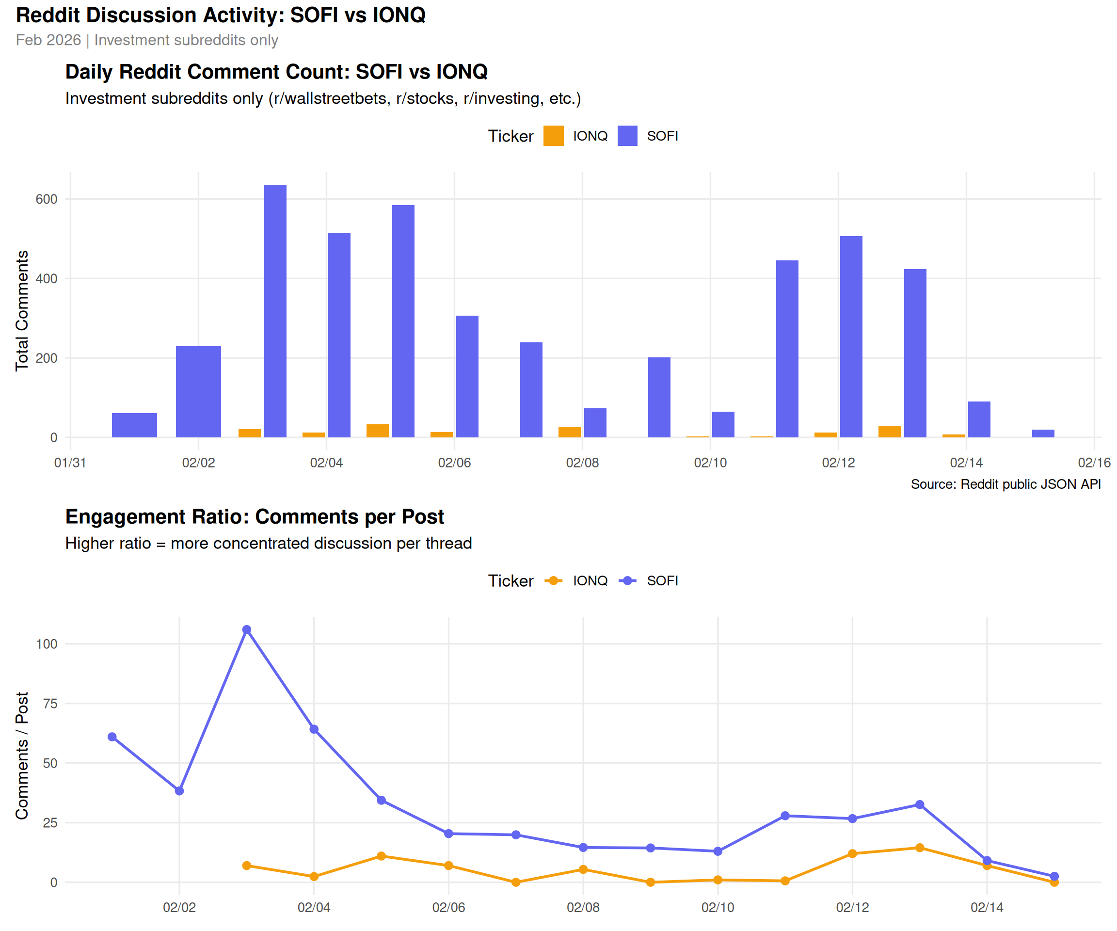
"Range: {min(daily_f$date)} ~ {max(daily_f$date)}"))Investment subs: 189 posts | Range: 2026-02-01 ~ 2026-02-15colors <- c("SOFI" = "#6366f1", "IONQ" = "#f59e0b")
p1 <- ggplot(daily_f, aes(x = date, y = total_comments, fill = symbol)) +
geom_col(position = position_dodge(width = 0.8), width = 0.7) +
scale_fill_manual(values = colors) +
scale_x_date(date_labels = "%m/%d", date_breaks = "2 days") +
scale_y_continuous(labels = comma) +
labs(
title = "Daily Reddit Comment Count: SOFI vs IONQ",
subtitle = "Investment subreddits only (r/wallstreetbets, r/stocks, r/investing, etc.)",
x = NULL,
y = "Total Comments",
fill = "Ticker",
caption = "Source: Reddit public JSON API"
) +
theme_minimal(base_size = 13) +
theme(
legend.position = "top",
plot.title = element_text(face = "bold"),
panel.grid.minor = element_blank()
)
p1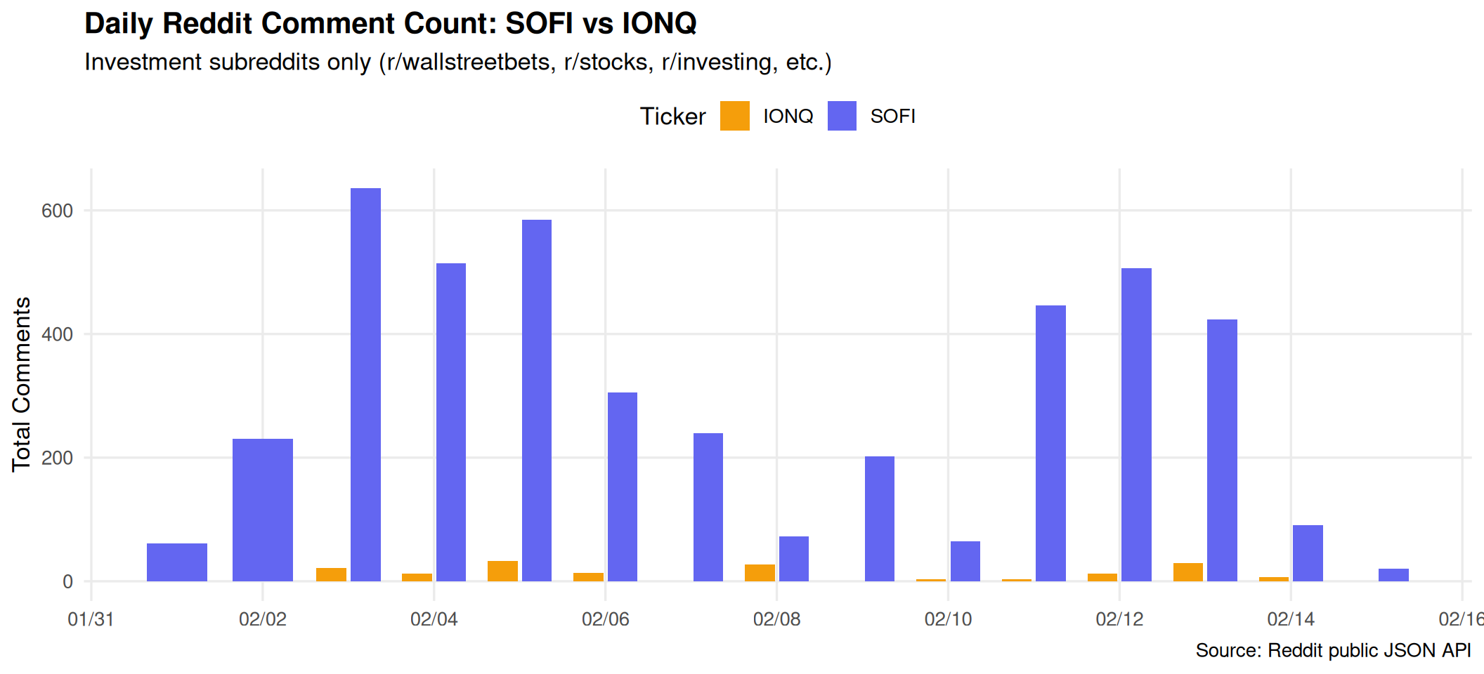
p2 <- ggplot(daily_f, aes(x = date, y = post_count, fill = symbol)) +
  geom_col(position = position_dodge(width = 0.8), width = 0.7) +
  scale_fill_manual(values = colors) +
  scale_x_date(date_labels = "%m/%d", date_breaks = "2 days") +
  labs(
    title = "Daily Reddit Post Count: SOFI vs IONQ",
    x = NULL,
    y = "Number of Posts",
    fill = "Ticker"
  ) +
  theme_minimal(base_size = 13) +
  theme(
    legend.position = "top",
    plot.title = element_text(face = "bold"),
    panel.grid.minor = element_blank()
  )

p2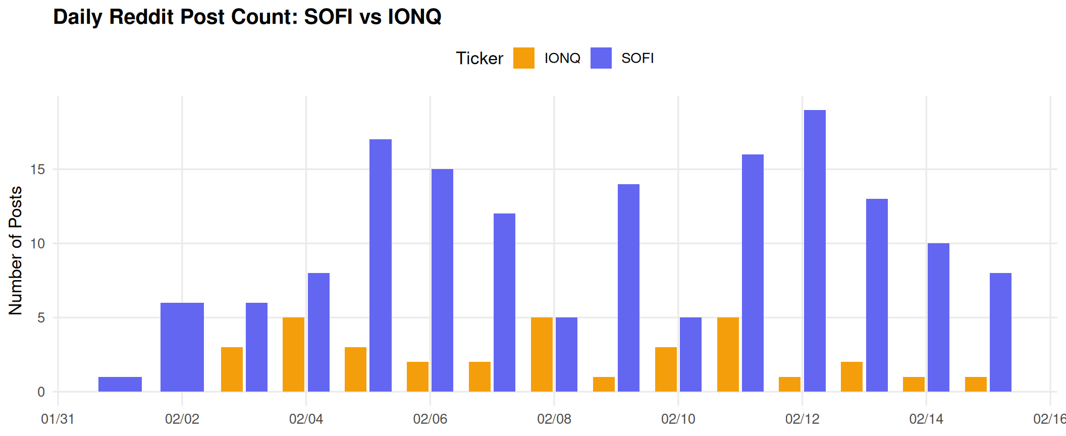
daily_f <- daily_f |>
  mutate(comments_per_post = round(total_comments / pmax(post_count, 1), 1))

p3 <- ggplot(daily_f, aes(x = date, y = comments_per_post, color = symbol)) +
  geom_line(linewidth = 1) +
  geom_point(size = 2.5) +
  scale_color_manual(values = colors) +
  scale_x_date(date_labels = "%m/%d", date_breaks = "2 days") +
  labs(
    title = "Engagement Ratio: Comments per Post",
    subtitle = "Higher ratio = more concentrated discussion per thread",
    x = NULL,
    y = "Comments / Post",
    color = "Ticker"
  ) +
  theme_minimal(base_size = 13) +
  theme(
    legend.position = "top",
    plot.title = element_text(face = "bold"),
    panel.grid.minor = element_blank()
  )

p3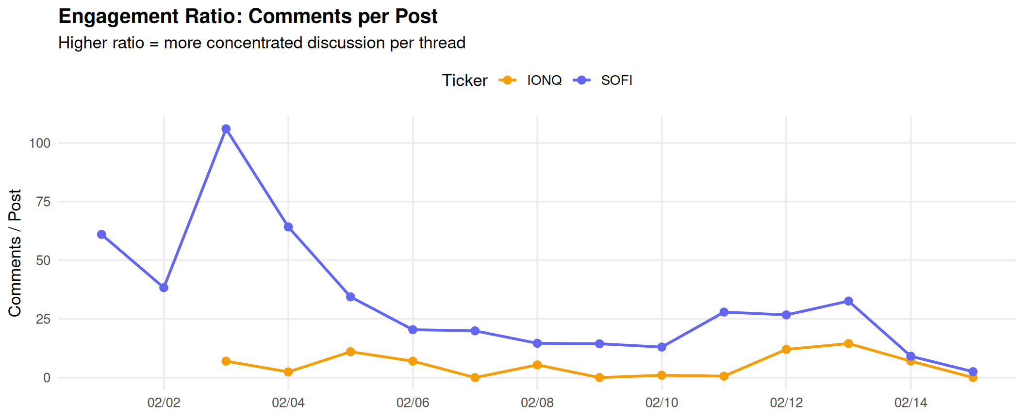
by_sub_f <- by_sub |>
  filter(subreddit %in% invest_subs) |>
  mutate(subreddit = fct_reorder(subreddit, total_comments, .fun = sum))

p4 <- ggplot(by_sub_f, aes(x = total_comments, y = subreddit, fill = symbol)) +
  geom_col(position = position_dodge(width = 0.7), width = 0.6) +
  scale_fill_manual(values = colors) +
  scale_x_continuous(labels = comma) +
  labs(
    title = "Comment Volume by Subreddit (14 days)",
    x = "Total Comments",
    y = NULL,
    fill = "Ticker"
  ) +
  theme_minimal(base_size = 13) +
  theme(
    legend.position = "top",
    plot.title = element_text(face = "bold"),
    panel.grid.minor = element_blank()
  )

p4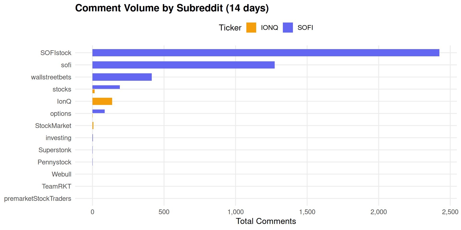
(p1 / p3) +
  plot_annotation(
    title = "Reddit Discussion Activity: SOFI vs IONQ",
    subtitle = "Feb 2026 | Investment subreddits only",
    theme = theme(
      plot.title = element_text(size = 16, face = "bold"),
      plot.subtitle = element_text(size = 12, color = "gray50")
    )
  )
This post is part of the TidyTuesday weekly data visualization project.