Show code
library(tidyverse)
library(scales)
library(glue)
library(patchwork)Building on last week’s raw comment count analysis, this week we implement the three-metric attention framework:
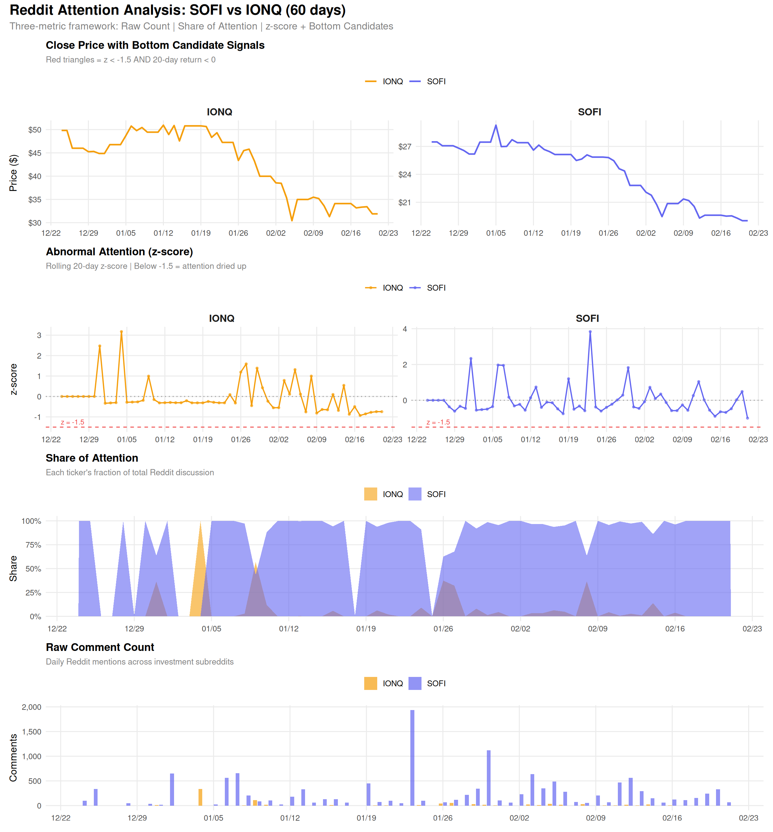
When z-score drops below -1.5 while the stock has declined over 20 days, we flag a bottom candidate – a period where “attention has dried up after a selloff.”
prepare_data.py)library(tidyverse)
library(scales)
library(glue)
library(patchwork)data_dir <- file.path(getwd(), "data")
metrics <- read_csv(file.path(data_dir, "attention_metrics.csv"),
show_col_types = FALSE) |>
mutate(date = as.Date(date))
price <- read_csv(file.path(data_dir, "price_data.csv"),
show_col_types = FALSE) |>
mutate(date = as.Date(date))
bc <- metrics |> filter(bottom_candidate == TRUE)
cat(glue("Date range: {min(metrics$date)} ~ {max(metrics$date)}\n",
"Bottom candidates: {nrow(bc)}"))Date range: 2025-12-24 ~ 2026-02-21
Bottom candidates: 0colors <- c("SOFI" = "#6366f1", "IONQ" = "#f59e0b")
theme_attention <- theme_minimal(base_size = 12) +
theme(
legend.position = "top",
plot.title = element_text(face = "bold", size = 13),
plot.subtitle = element_text(color = "gray50", size = 10),
panel.grid.minor = element_blank(),
strip.text = element_text(face = "bold", size = 12)
)# Use only rows with price data
price_metrics <- metrics |> filter(!is.na(close))
p_price <- ggplot(price_metrics, aes(x = date, y = close, color = symbol)) +
geom_line(linewidth = 0.9) +
geom_point(
data = price_metrics |> filter(bottom_candidate == TRUE),
aes(x = date, y = close),
shape = 24, size = 3, fill = "#ef4444", color = "#ef4444"
) +
scale_color_manual(values = colors) +
scale_x_date(date_labels = "%m/%d", date_breaks = "1 week") +
scale_y_continuous(labels = dollar) +
facet_wrap(~symbol, scales = "free_y") +
labs(
title = "Close Price with Bottom Candidate Signals",
subtitle = "Red triangles = z < -1.5 AND 20-day return < 0",
x = NULL, y = "Price ($)", color = NULL
) +
theme_attention
p_price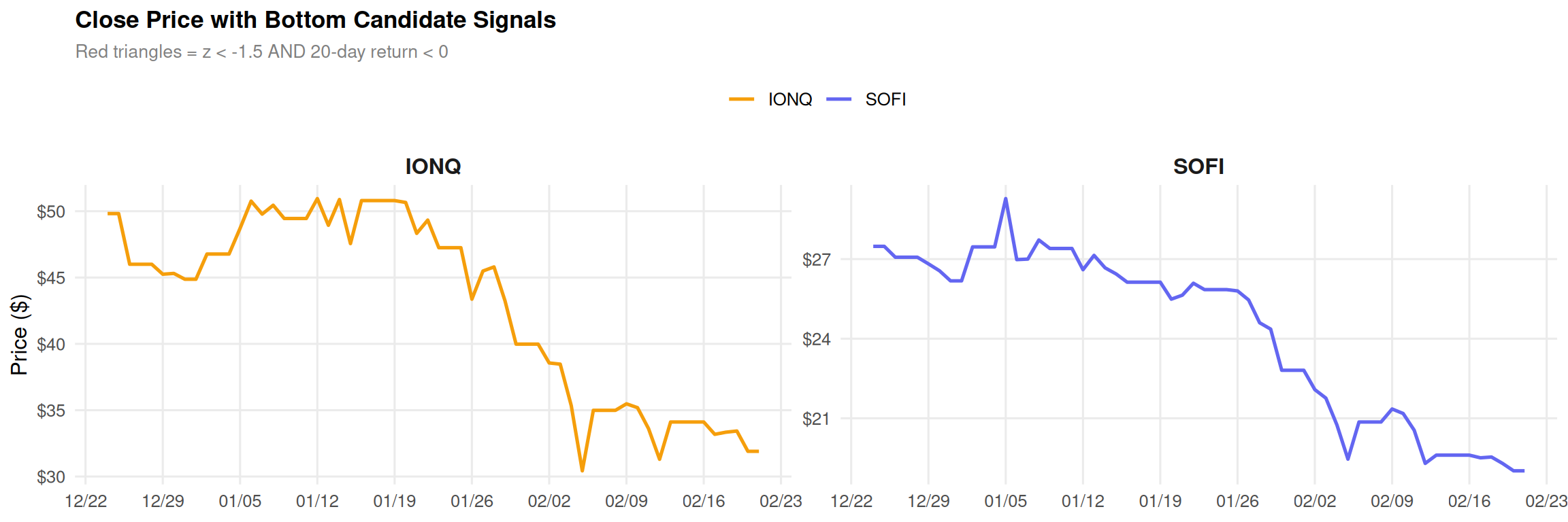
p_zscore <- ggplot(metrics, aes(x = date, y = z_score, color = symbol)) +
  geom_line(linewidth = 0.7) +
  geom_point(size = 1, alpha = 0.6) +
  geom_hline(yintercept = -1.5, linetype = "dashed", color = "#ef4444", linewidth = 0.5) +
  geom_hline(yintercept = 0, linetype = "dotted", color = "gray60") +
  annotate("text", x = min(metrics$date) + 2, y = -1.5, label = "z = -1.5",
           vjust = -0.5, color = "#ef4444", size = 3) +
  scale_color_manual(values = colors) +
  scale_x_date(date_labels = "%m/%d", date_breaks = "1 week") +
  facet_wrap(~symbol, scales = "free_y") +
  labs(
    title = "Abnormal Attention (z-score)",
    subtitle = "Rolling 20-day z-score | Below -1.5 = attention dried up",
    x = NULL, y = "z-score", color = NULL
  ) +
  theme_attention

p_zscore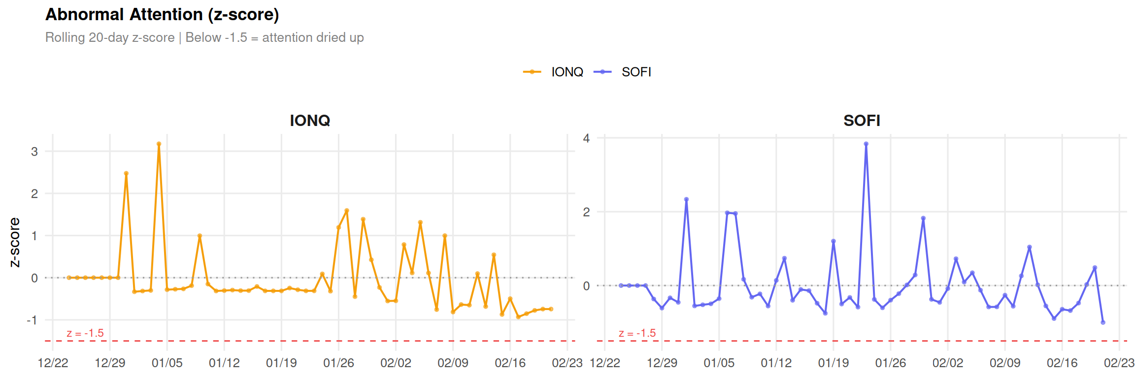
p_share <- ggplot(metrics, aes(x = date, y = share, fill = symbol)) +
  geom_area(alpha = 0.6, position = "identity") +
  scale_fill_manual(values = colors) +
  scale_x_date(date_labels = "%m/%d", date_breaks = "1 week") +
  scale_y_continuous(labels = percent) +
  labs(
    title = "Share of Attention",
    subtitle = "Each ticker's fraction of total Reddit discussion",
    x = NULL, y = "Share", fill = NULL
  ) +
  theme_attention

p_share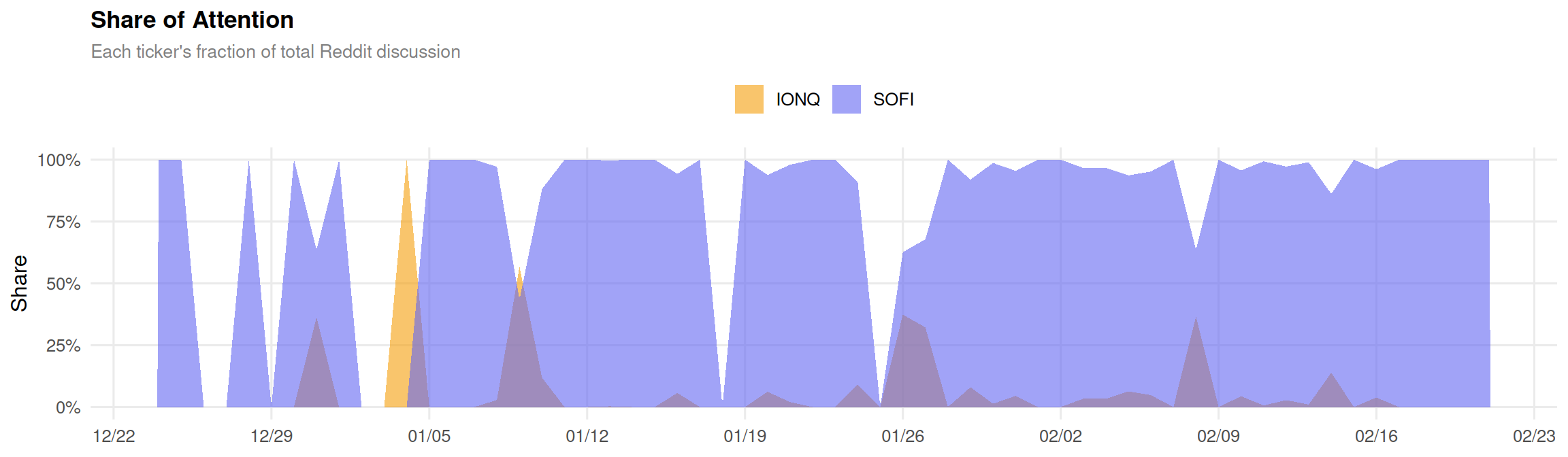
p_raw <- ggplot(metrics, aes(x = date, y = raw_count, fill = symbol)) +
  geom_col(position = position_dodge(width = 0.8), width = 0.7, alpha = 0.7) +
  scale_fill_manual(values = colors) +
  scale_x_date(date_labels = "%m/%d", date_breaks = "1 week") +
  scale_y_continuous(labels = comma) +
  labs(
    title = "Raw Comment Count",
    subtitle = "Daily Reddit mentions across investment subreddits",
    x = NULL, y = "Comments", fill = NULL
  ) +
  theme_attention

p_raw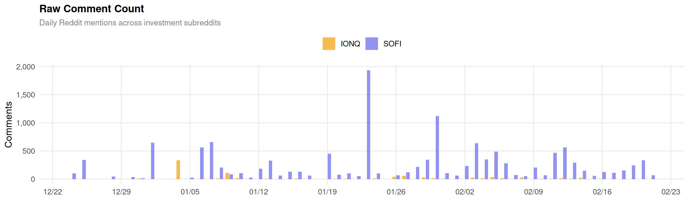
(p_price / p_zscore / p_share / p_raw) +
  plot_annotation(
    title = "Reddit Attention Analysis: SOFI vs IONQ (60 days)",
    subtitle = "Three-metric framework: Raw Count | Share of Attention | z-score + Bottom Candidates",
    theme = theme(
      plot.title = element_text(size = 17, face = "bold"),
      plot.subtitle = element_text(size = 12, color = "gray50")
    )
  )
This post is part of the TidyTuesday weekly data visualization project.