Show code
library(tidyverse)
library(scales)
library(glue)
library(patchwork)When someone says a risk is “likely” or “probable,” what probability do they actually mean? This week’s TidyTuesday uses the CAPphrase dataset – over 98,000 probability judgements from 5,000+ participants – to show that verbal probability is not a stable interface.
The same word can mean 60% to one person and 90% to another. In risk communication, finance, and forecasting, this ambiguity creates hidden decision risk.
library(tidyverse)
library(scales)
library(glue)
library(patchwork)data_dir <- file.path(getwd(), "data")
judgements <- read_csv(file.path(data_dir, "absolute_judgements.csv"),
show_col_types = FALSE)
pairwise <- read_csv(file.path(data_dir, "pairwise_comparisons.csv"),
show_col_types = FALSE)
metadata <- read_csv(file.path(data_dir, "respondent_metadata.csv"),
show_col_types = FALSE)
cat(glue(
"Judgements: {nrow(judgements)} rows ({n_distinct(judgements$response_id)} respondents)\n",
"Pairwise: {nrow(pairwise)} comparisons\n",
"Phrases: {n_distinct(judgements$term)}"
))Judgements: 98306 rows (5174 respondents)
Pairwise: 51740 comparisons
Phrases: 19theme_fm <- theme_minimal(base_size = 12) +
theme(
plot.background = element_rect(fill = "white", color = NA),
panel.background = element_rect(fill = "#f8fafc", color = NA),
panel.grid.major = element_line(color = "#e2e8f0", linewidth = 0.3),
panel.grid.minor = element_blank(),
text = element_text(color = "#334155"),
axis.text = element_text(color = "#475569"),
plot.title = element_text(color = "#1e293b", face = "bold", size = 14),
plot.subtitle = element_text(color = "#64748b", size = 10),
plot.caption = element_text(
face = "italic", color = "#94a3b8", size = 9,
hjust = 0, margin = margin(t = 12)
),
plot.caption.position = "plot",
strip.text = element_text(color = "#1e293b", face = "bold"),
legend.background = element_rect(fill = "white", color = NA),
legend.text = element_text(color = "#475569"),
plot.margin = margin(15, 15, 15, 15)
)How do people map words to numbers? Each dot shows the median estimate; the bar shows the interquartile range (25th-75th percentile).
phrase_stats <- judgements |>
  group_by(term) |>
  summarise(
    median_prob = median(probability, na.rm = TRUE),
    mean_prob = mean(probability, na.rm = TRUE),
    sd_prob = sd(probability, na.rm = TRUE),
    q25 = quantile(probability, 0.25, na.rm = TRUE),
    q75 = quantile(probability, 0.75, na.rm = TRUE),
    q10 = quantile(probability, 0.10, na.rm = TRUE),
    q90 = quantile(probability, 0.90, na.rm = TRUE),
    n = n(),
    .groups = "drop"
  ) |>
  mutate(iqr = q75 - q25) |>
  arrange(median_prob)

phrase_stats$term <- factor(phrase_stats$term, levels = phrase_stats$term)

p1 <- ggplot(phrase_stats, aes(y = term)) +
  geom_segment(aes(x = q10, xend = q90, yend = term),
               color = "#cbd5e1", linewidth = 1.5) +
  geom_segment(aes(x = q25, xend = q75, yend = term),
               color = "#3b82f6", linewidth = 3, alpha = 0.8) +
  geom_point(aes(x = median_prob), color = "#1e293b", size = 3) +
  geom_vline(xintercept = 50, linetype = "dashed", color = "#94a3b8", linewidth = 0.5) +
  scale_x_continuous(
    breaks = seq(0, 100, 25),
    labels = \(x) paste0(x, "%"),
    limits = c(0, 100)
  ) +
  labs(
    title = "How People Interpret Probability Phrases",
    subtitle = "Dot = median | Thick bar = IQR (25-75%) | Thin line = 10-90%",
    x = "Probability (%)",
    y = NULL
  ) +
  theme_fm

p1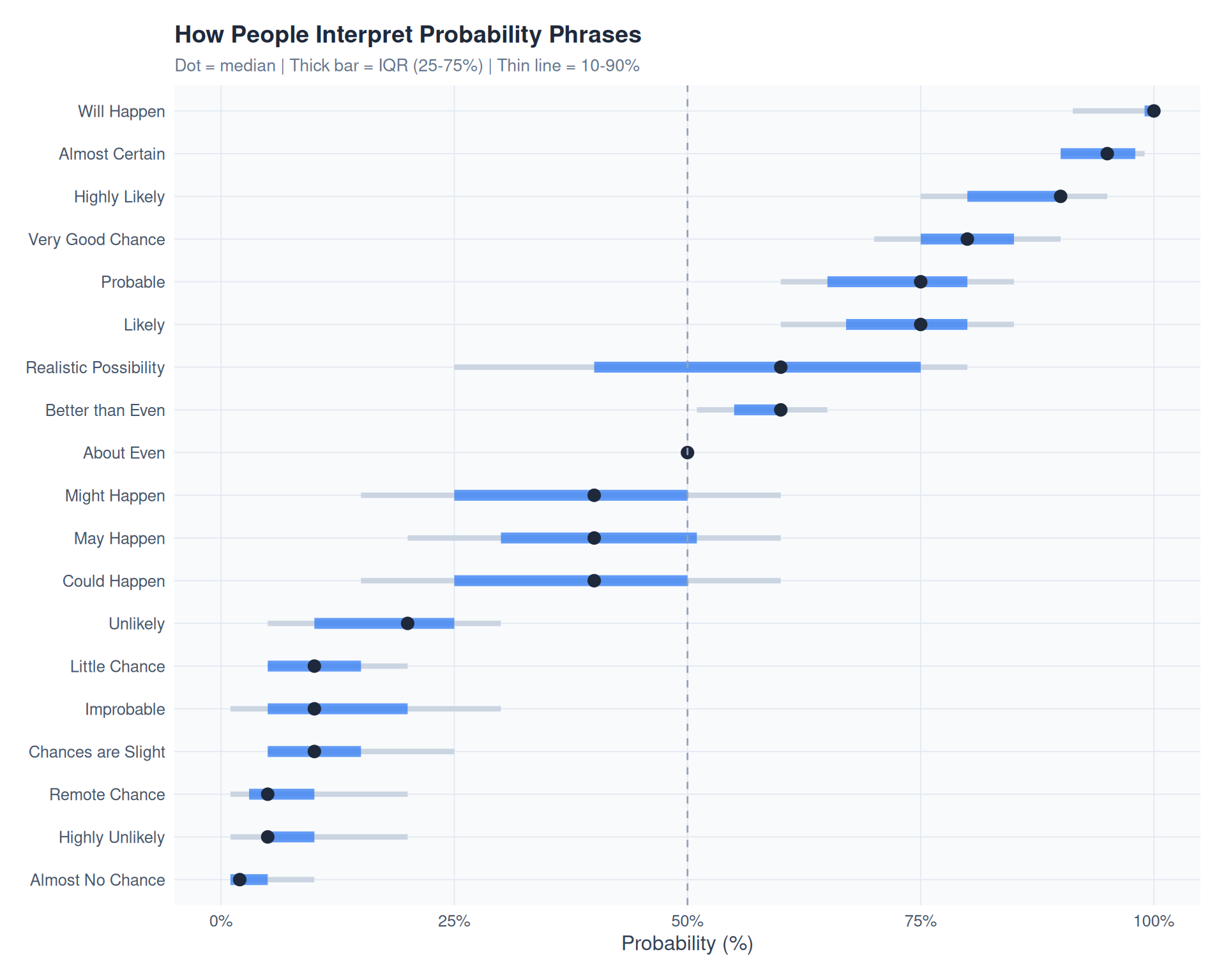
Standard deviation as a proxy for interpretation risk – higher SD means the phrase is more ambiguous.
phrase_ordered <- phrase_stats |> arrange(desc(sd_prob))
phrase_ordered$term <- factor(phrase_ordered$term, levels = phrase_ordered$term)

p2 <- ggplot(phrase_ordered, aes(x = term, y = sd_prob, fill = sd_prob)) +
  geom_col(width = 0.7) +
  scale_fill_gradient2(
    low = "#10b981", mid = "#f59e0b", high = "#ef4444",
    midpoint = median(phrase_ordered$sd_prob),
    guide = "none"
  ) +
  scale_y_continuous(expand = expansion(mult = c(0, 0.1))) +
  labs(
    title = "Interpretation Risk by Phrase",
    subtitle = "Standard deviation of probability estimates (higher = more ambiguous)",
    x = NULL,
    y = "Std Dev"
  ) +
  theme_fm +
  theme(axis.text.x = element_text(angle = 45, hjust = 1, size = 9))

p2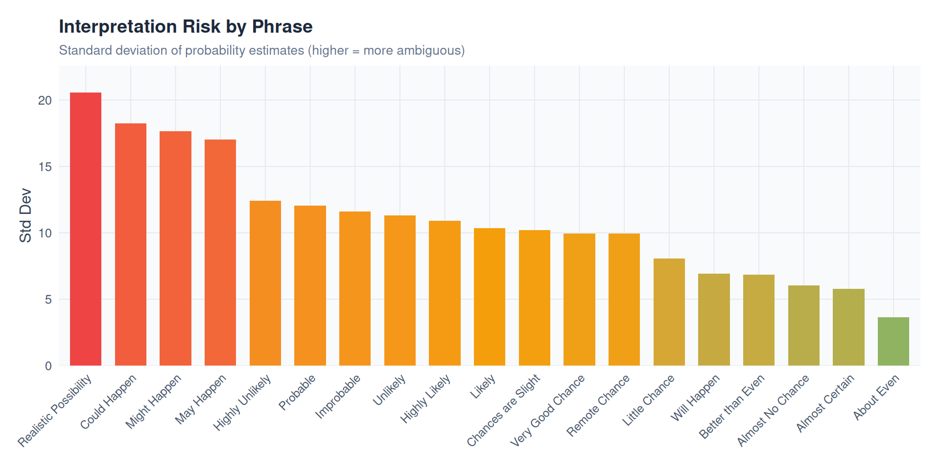
rounding <- judgements |>
  mutate(
    ends_0 = probability %% 10 == 0,
    ends_5 = probability %% 5 == 0 & !ends_0,
    round_type = case_when(
      ends_0 ~ "Multiple of 10",
      ends_5 ~ "Multiple of 5",
      TRUE ~ "Other"
    )
  ) |>
  count(round_type) |>
  mutate(pct = n / sum(n))

round_colors <- c("Multiple of 10" = "#3b82f6", "Multiple of 5" = "#f59e0b", "Other" = "#475569")

p3 <- ggplot(rounding, aes(x = round_type, y = pct, fill = round_type)) +
  geom_col(width = 0.6) +
  geom_text(aes(label = percent(pct, accuracy = 0.1)),
            vjust = -0.5, color = "#1e293b", size = 4) +
  scale_y_continuous(labels = percent, limits = c(0, max(rounding$pct) * 1.15)) +
  scale_fill_manual(values = round_colors, guide = "none") +
  labs(
    title = "Round-Number Bias",
    subtitle = "People overwhelmingly estimate in multiples of 5 or 10",
    x = NULL,
    y = "Share of Responses"
  ) +
  theme_fm

p3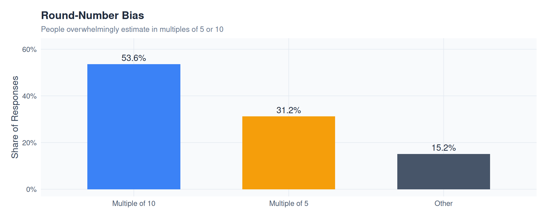
combined <- p1 / (p2 | p3) +
  plot_layout(heights = c(2, 1)) +
  plot_annotation(
    title = "How Likely is 'Likely'?",
    subtitle = "98,000+ judgements from 5,000+ participants reveal that probability words are unreliable interfaces",
    caption = "Note: 98,000+ probability judgements from 5,174 respondents  |  Source: CAPphrase (Kucharski, 2024)  |  \u00A9 2026 chokotto",
    theme = theme(
      plot.background = element_rect(fill = "white", color = NA),
      plot.title = element_text(color = "#1e293b", face = "bold", size = 18),
      plot.subtitle = element_text(color = "#64748b", size = 12),
      plot.caption = element_text(
        face = "italic", color = "#94a3b8", size = 9,
        hjust = 0, margin = margin(t = 12)
      ),
      plot.caption.position = "plot"
    )
  )

combined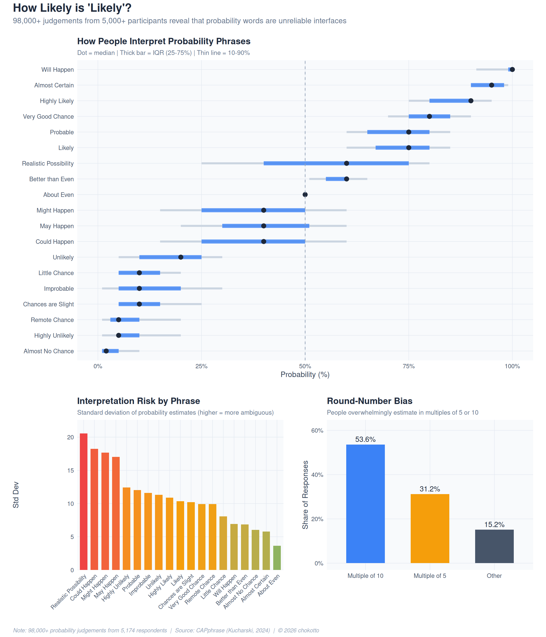
This post is part of the TidyTuesday weekly data visualization project.