Code
library(tidyverse)
library(scales)
library(glue)
library(patchwork)
library(ggtext)
library(ggrepel)
library(showtext)
library(colorspace)
library(janitor)
library(forcats)
library(lubridate)Repair Cafes are free community events where volunteers help people fix broken items – from electronics and clothing to furniture and bicycles. This dataset captures over 200,000 repair attempts across 40+ countries, tracked by the Repair Monitor platform. We explore which product categories are most repairable, how the movement has grown geographically, the distribution of repairability scores, and what information sources repair volunteers rely on.
library(tidyverse)
library(scales)
library(glue)
library(patchwork)
library(ggtext)
library(ggrepel)
library(showtext)
library(colorspace)
library(janitor)
library(forcats)
library(lubridate)repairs <- readr::read_csv(
"https://raw.githubusercontent.com/rfordatascience/tidytuesday/main/data/2026/2026-04-07/repairs.csv",
show_col_types = FALSE
)
repairs_text <- readr::read_csv(
"https://raw.githubusercontent.com/rfordatascience/tidytuesday/main/data/2026/2026-04-07/repairs_text.csv",
show_col_types = FALSE
)
repairs <- repairs |>
mutate(
repair_date = as.Date(repair_date),
year = year(repair_date)
)NOTE_TEXT <- "Repair outcomes from Repair Cafes worldwide (2015-2025)"
SOURCE_TEXT <- "TidyTuesday 2026-04-07 / Repair Monitor"
CAPTION <- glue("Note: {NOTE_TEXT} | Source: {SOURCE_TEXT} | \u00A9 2026 chokotto")
STYLE_MODE <- "figmamake"
theme_fm <- theme_minimal(base_size = 12) +
theme(
plot.background = element_rect(fill = "white", color = NA),
panel.background = element_rect(fill = "#f8fafc", color = NA),
panel.grid.major = element_line(color = "#e2e8f0", linewidth = 0.3),
panel.grid.minor = element_blank(),
text = element_text(color = "#334155"),
axis.text = element_text(color = "#475569"),
plot.title = element_text(color = "#1e293b", face = "bold", size = 14),
plot.subtitle = element_text(color = "#64748b", size = 10),
plot.caption = element_text(
face = "italic", color = "#94a3b8", size = 9,
hjust = 0, margin = margin(t = 12)
),
plot.caption.position = "plot",
strip.text = element_text(color = "#1e293b", face = "bold"),
legend.background = element_rect(fill = "white", color = NA),
legend.text = element_text(color = "#475569"),
plot.margin = margin(15, 15, 15, 15)
)
theme_active <- theme_fm
COL_PRIMARY <- "#3b82f6"
COL_SECONDARY <- "#f59e0b"
COL_ALERT <- "#ef4444"
COL_POSITIVE <- "#10b981"
COL_BASE <- "#94a3b8"success_by_cat <- repairs |>
filter(!is.na(category), !is.na(repaired)) |>
group_by(category) |>
summarise(
total = n(),
n_yes = sum(repaired == "yes", na.rm = TRUE),
pct_yes = n_yes / total,
.groups = "drop"
) |>
filter(total >= 50) |>
slice_max(total, n = 15) |>
mutate(
category = fct_reorder(category, pct_yes),
bar_color = case_when(
pct_yes >= 0.70 ~ COL_POSITIVE,
pct_yes <= 0.30 ~ COL_ALERT,
TRUE ~ COL_PRIMARY
)
)
avg_rate <- repairs |>
filter(!is.na(repaired)) |>
summarise(pct = mean(repaired == "yes")) |>
pull(pct)
ggplot(success_by_cat, aes(x = pct_yes, y = category)) +
geom_segment(
aes(x = 0, xend = pct_yes, yend = category),
color = "#e2e8f0", linewidth = 0.8
) +
geom_point(aes(color = bar_color), size = 5) +
geom_vline(
xintercept = avg_rate, linetype = "dashed",
color = COL_BASE, linewidth = 0.5
) +
annotate(
"text", x = avg_rate + 0.01, y = 1, hjust = 0,
label = glue("Overall avg: {percent(avg_rate, accuracy = 0.1)}"),
color = COL_BASE, size = 3, fontface = "italic"
) +
geom_text(
aes(label = percent(pct_yes, accuracy = 1)),
hjust = -0.5, size = 3.2, color = "#475569"
) +
scale_x_continuous(
labels = percent_format(), expand = expansion(mult = c(0, 0.15))
) +
scale_color_identity() +
labs(
title = "Repair success varies widely by category",
subtitle = glue(
"Top 15 categories by volume | ",
"Green = >70% success, Red = <30%, Blue = between"
),
x = "Repair success rate (% fully repaired)",
y = NULL,
caption = CAPTION
) +
theme_active +
theme(panel.grid.major.y = element_blank())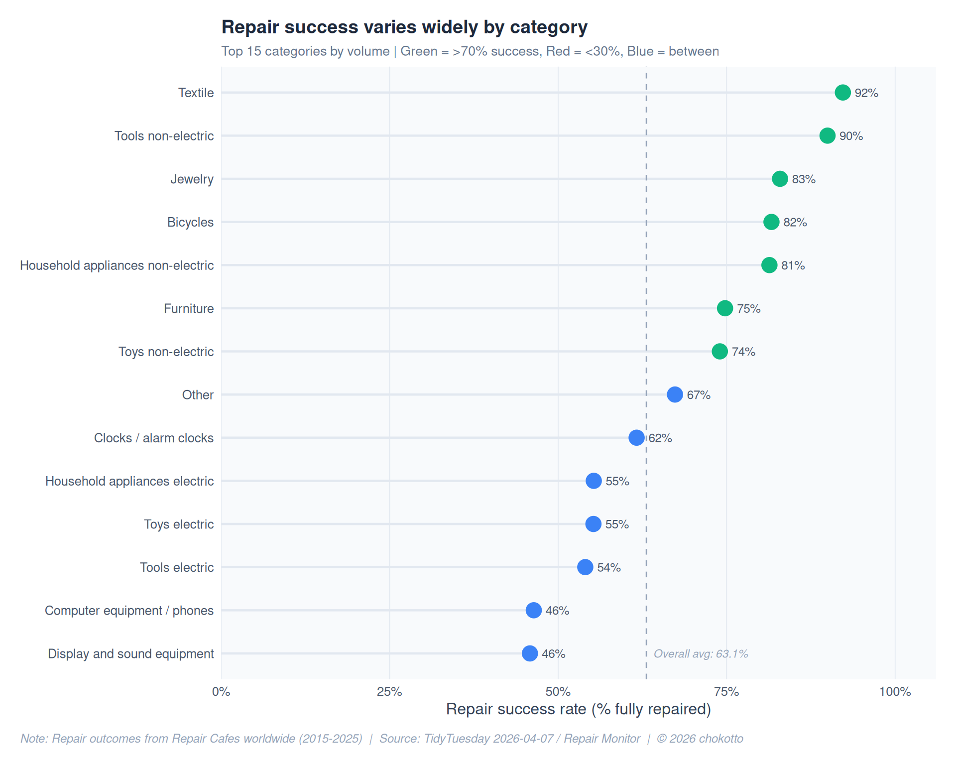
cafe_growth <- repairs |>
  filter(
    !is.na(country), !is.na(year),
    year >= 2015, year <= 2025
  ) |>
  distinct(year, country, repair_cafe_number) |>
  count(year, country, name = "n_cafes")

top_countries <- cafe_growth |>
  group_by(country) |>
  summarise(total = sum(n_cafes), .groups = "drop") |>
  slice_max(total, n = 5) |>
  pull(country)

cafe_top5 <- cafe_growth |>
  filter(country %in% top_countries) |>
  mutate(country = fct_reorder(country, -n_cafes, .fun = max))

country_colors <- setNames(
  c(COL_PRIMARY, COL_SECONDARY, COL_POSITIVE, COL_ALERT, "#8b5cf6"),
  levels(cafe_top5$country)
)

label_df <- cafe_top5 |>
  group_by(country) |>
  slice_max(year, n = 1) |>
  ungroup()

ggplot(cafe_top5, aes(x = year, y = n_cafes, color = country)) +
  geom_line(linewidth = 1.1, alpha = 0.85) +
  geom_point(size = 2, alpha = 0.7) +
  geom_text_repel(
    data = label_df,
    aes(label = country),
    direction = "y", nudge_x = 0.4,
    hjust = 0, size = 3.3, fontface = "bold",
    segment.color = "#e2e8f0", segment.size = 0.3
  ) +
  scale_color_manual(values = country_colors) +
  scale_x_continuous(breaks = seq(2015, 2025, 2)) +
  scale_y_continuous(labels = comma_format()) +
  labs(
    title = "Repair Cafe presence is growing fast, led by the Netherlands",
    subtitle = "Number of unique Repair Cafes active per year (top 5 countries)",
    x = "Year",
    y = "Active Repair Cafes",
    caption = CAPTION
  ) +
  theme_active +
  theme(legend.position = "none")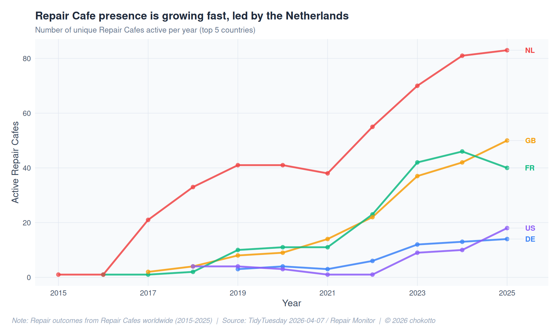
repair_scores <- repairs |>
  filter(
    !is.na(repairability), !is.na(kind_of_product),
    repairability >= 1, repairability <= 10
  )

top_products <- repair_scores |>
  count(kind_of_product, sort = TRUE) |>
  slice_head(n = 8) |>
  pull(kind_of_product)

repair_scores_top <- repair_scores |>
  filter(kind_of_product %in% top_products) |>
  mutate(kind_of_product = fct_reorder(kind_of_product, repairability, .fun = median))

median_df <- repair_scores_top |>
  group_by(kind_of_product) |>
  summarise(med = median(repairability), .groups = "drop")

ggplot(repair_scores_top, aes(x = repairability, y = kind_of_product)) +
  geom_violin(
    fill = lighten(COL_PRIMARY, 0.6),
    color = COL_PRIMARY, alpha = 0.5,
    scale = "width", width = 0.75
  ) +
  geom_boxplot(
    width = 0.15, outlier.shape = NA,
    fill = "white", color = "#475569", linewidth = 0.4
  ) +
  geom_point(
    data = median_df,
    aes(x = med, y = kind_of_product),
    color = COL_ALERT, size = 3, shape = 18
  ) +
  scale_x_continuous(breaks = 1:10) +
  labs(
    title = "Repairability varies significantly by product type",
    subtitle = "Distribution of repairability scores (1 = impossible, 10 = easy) | Diamond = median",
    x = "Repairability Score",
    y = NULL,
    caption = CAPTION
  ) +
  theme_active +
  theme(panel.grid.major.y = element_blank())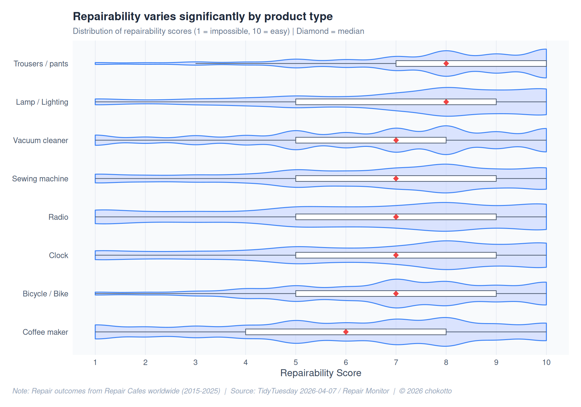
info_sources <- repairs |>
  inner_join(repairs_text, by = "repair_id") |>
  filter(
    !is.na(used_repair_info),
    used_repair_info == "yes",
    !is.na(repair_info_source),
    repair_info_source != ""
  )

source_counts <- info_sources |>
  mutate(repair_info_source = str_split(repair_info_source, ",\\s*")) |>
  unnest(repair_info_source) |>
  mutate(
    repair_info_source = str_trim(repair_info_source),
    repair_info_source = str_to_title(repair_info_source)
  ) |>
  filter(repair_info_source != "") |>
  count(repair_info_source, sort = TRUE) |>
  slice_head(n = 10) |>
  mutate(
    repair_info_source = fct_reorder(repair_info_source, n),
    highlight = if_else(row_number() <= 3, TRUE, FALSE)
  )

ggplot(source_counts, aes(x = n, y = repair_info_source)) +
  geom_col(
    aes(fill = highlight),
    width = 0.7
  ) +
  geom_text(
    aes(label = comma(n)),
    hjust = -0.2, size = 3.2, color = "#475569"
  ) +
  scale_fill_manual(
    values = c("TRUE" = COL_PRIMARY, "FALSE" = lighten(COL_BASE, 0.3)),
    guide = "none"
  ) +
  scale_x_continuous(
    labels = comma_format(), expand = expansion(mult = c(0, 0.15))
  ) +
  labs(
    title = "Repair volunteers turn to online resources first",
    subtitle = "Top 10 information sources used when repair info was consulted",
    x = "Number of repairs using this source",
    y = NULL,
    caption = CAPTION
  ) +
  theme_active +
  theme(panel.grid.major.y = element_blank())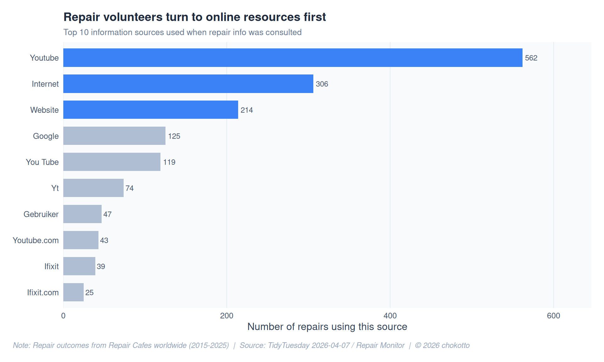
This post is part of the TidyTuesday weekly data visualization project.